Best Buy · Mobile UX · 2021
How do you save $2M on home deliveries?
What is Geek Squad by Best Buy?
Best Buy is the largest consumer electronics retailer in the United States. Their Geek Squad service handles tech support, repair, and large appliance installation for millions of customers annually. Customers schedule, track, and manage service appointments primarily through the Best Buy app.
Overview
As Senior UX Designer at Best Buy, I led the end-to-end design of an improved appointment preparation experience in the Best Buy app — helping customers understand how to prepare for large appliance deliveries before the delivery team arrived. The project went from research through user testing to shipped product.
The Problem
Failed deliveries were costing $2 million annually
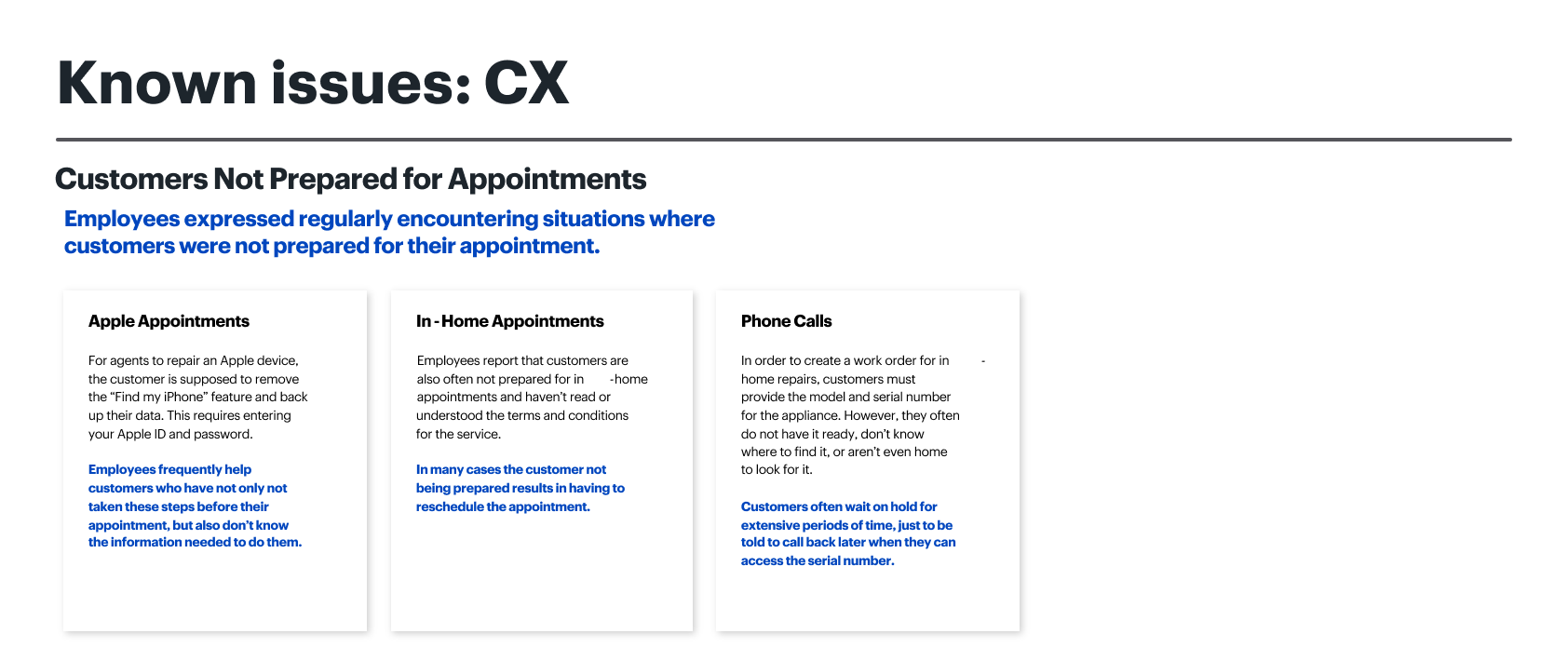
Customers purchasing large appliances — refrigerators, washing machines, dishwashers — were frequently unprepared when the delivery team arrived. The delivery failed, had to be rescheduled, and cost the company and the customer time and money. Best Buy was losing $2 million annually on failed home deliveries alone.
Known issues — documenting the current state failure points
Challenges
- Finding the right balance between enough information and too much
- Making preparation content visually digestible, not a wall of text
- Reflecting the right prep steps for different product types
- Accounting for legal content requirements without letting them dominate
- Working within the existing app architecture and competing design priorities
Process
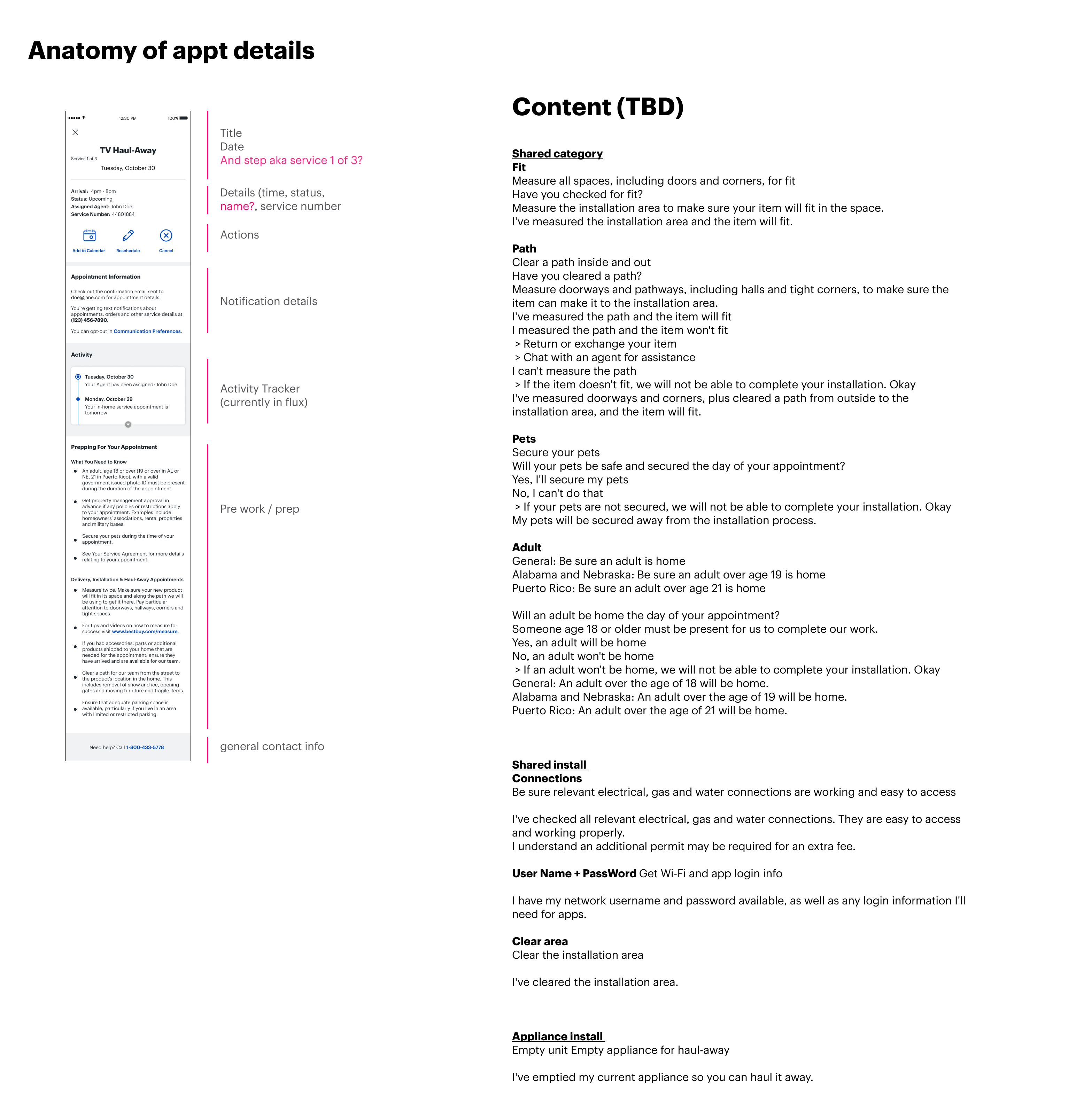
Anatomy of the current experience
Audited the existing appointment prep screen — what content was there, what was missing, and where it lived in the app flow.
Anatomy of the current appointment detail screen
Journey mapping and sharing across the company
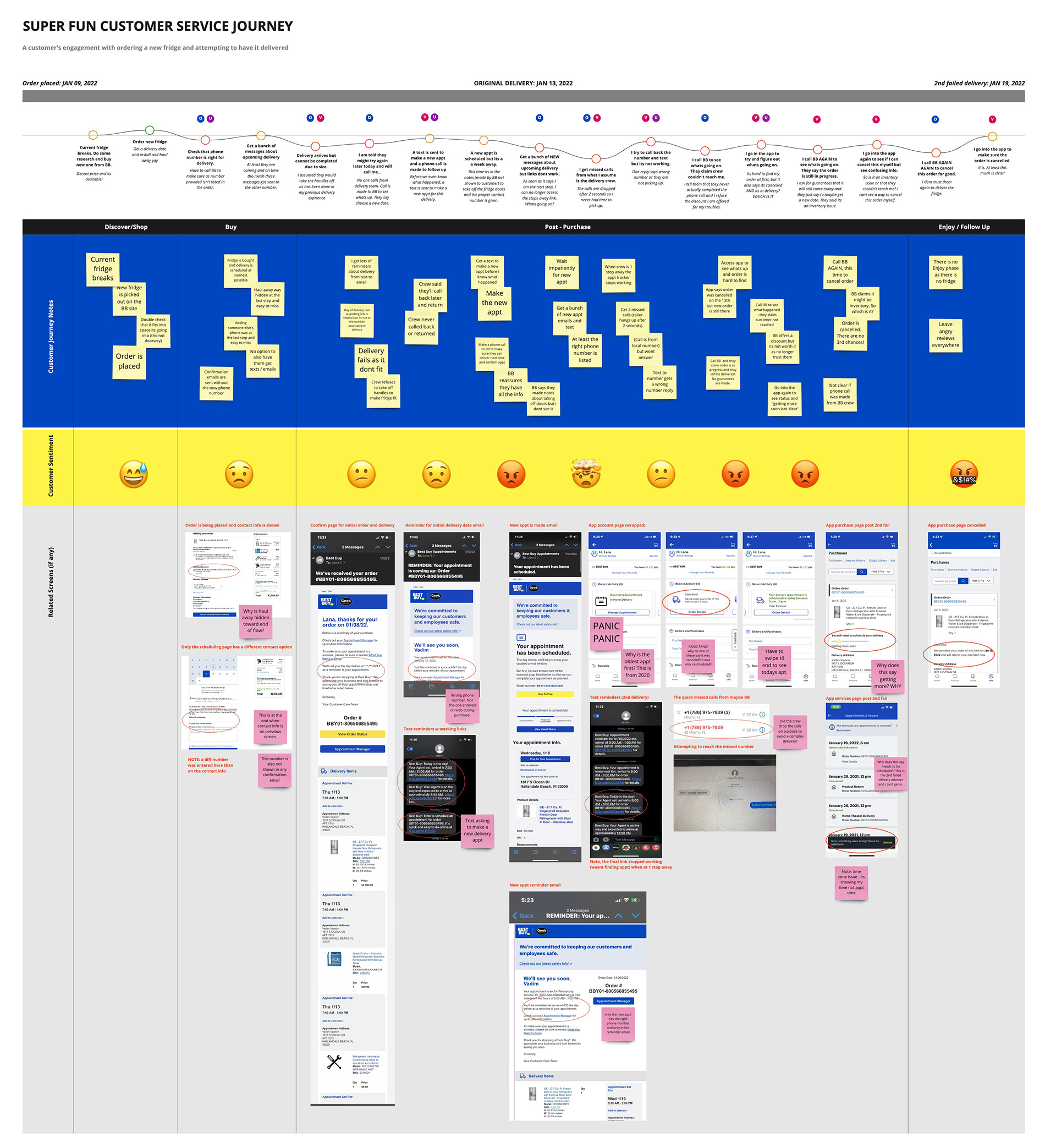
I mapped the real customer journey from purchase through delivery — understanding exactly where customers were getting lost and what information they needed, and when. I shared this across teams working on different touchpoints of the journey, giving them a bird’s-eye view of the full experience for the first time.
Customer journey map — purchase through delivery, surfacing key failure points
Iterate on the prep experience
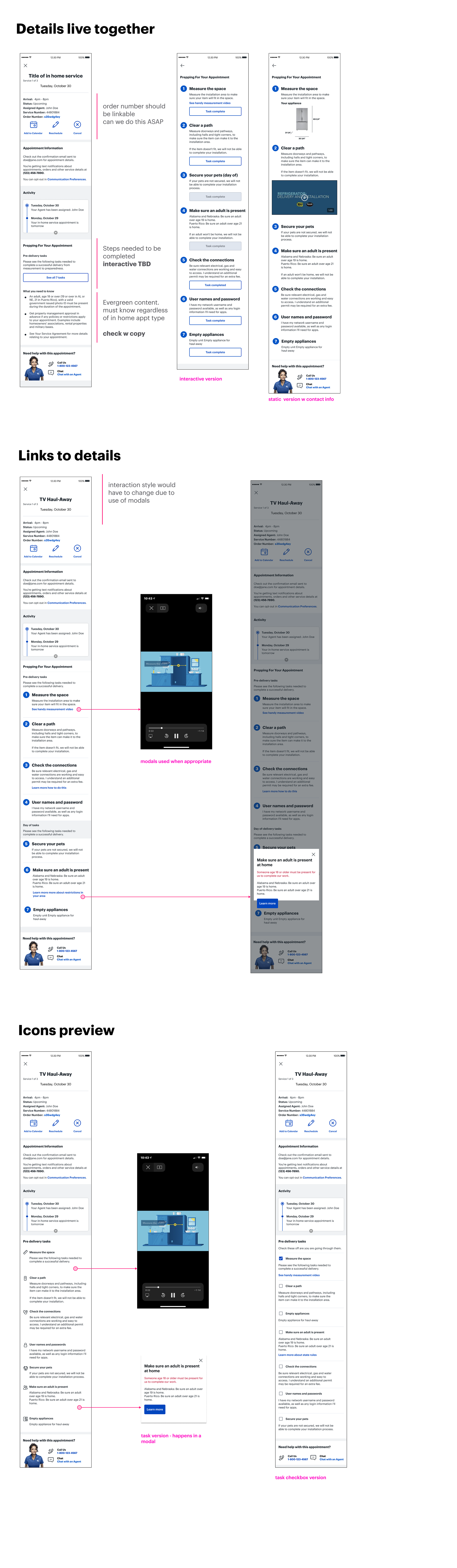
Explored three approaches for surfacing preparation content — each with a different balance of information density and visual clarity.
Design explorations — three approaches for surfacing preparation content
User testing
Tested the icon-based direction with 15 real customers. We set up a realistic scenario to ground participants in the experience before testing.
Setting the scene
- —Imagine you just bought a refrigerator from Best Buy and chosen a day and time to have it delivered
- —You've chosen to have it installed and your old refrigerator hauled away by the same delivery people
- —Your delivery appointment is coming up in a few days — Best Buy and you want to make sure it's successful
- —Looking at the details of your appointment, how would you ensure success?
What we wanted to accomplish
To test whether users can access appointment details and are clear on how to complete the tasks.
Additionally, we wanted to see how encouraged users feel to interact with task-oriented content and how clear the tasks are — including whether anything felt missing or unclear as presented.
Results summary — 15 participants, completed July 2021
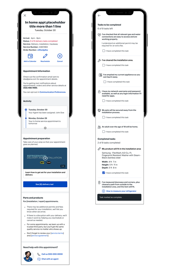
Results summary
15 participants total — Completed July 2021
- —Access appointment details from overview
- —Give feedback on appointment details
- —Access appointment tasks
- —Go back to appointment details
Tested design flow
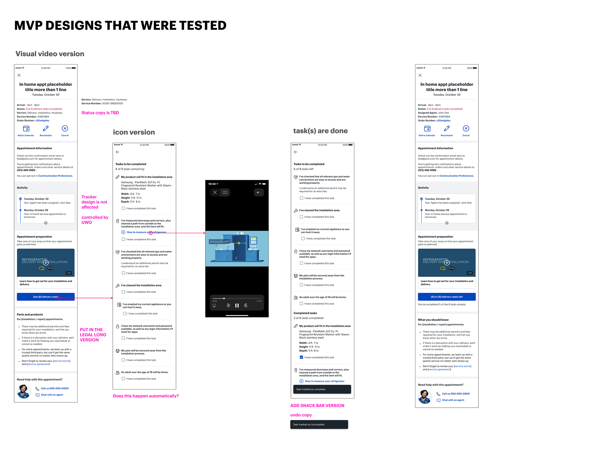
Formidable quotes on tasks
“Feels like buying a car AND THEN scheduling driving lessons.”
“No other company does this [checklist]! Nice.”
“Is there a KUDOS that you’re all ready?”
“These things are important but not sure I feel compelled!”
Top feedback
Most customers found the detail page helpful and informative, though not everyone engaged with the video. Tasks were generally clear and easy to find — the main asks were splitting them into day-of vs. pre-delivery, and adding a "completed" state. For help and returns, most customers already knew to chat or call, but wanted more clarity on what Best Buy could actually help with.
Iterate & launch
Incorporated feedback from testing, addressed edge cases across product categories, and launched the MVP.
Recommendations & next steps
Landing / Detail
- Interactive status
- Less focus on video / clearer actions
- Pre / during / done state
- Clarity about necessity
- More info around cancellation limitations
- Update tracker to reflect tasks
Tasks
- Split into day-of and pre
- Let people know what they might need
- Clarity about what might already have been done at purchase
- Easier to understand phrasing for advanced items
Return / Help
- Leave most of this as is
- More clarity as to what Best Buy actually helps with
Appointment history — tracking service history in the app
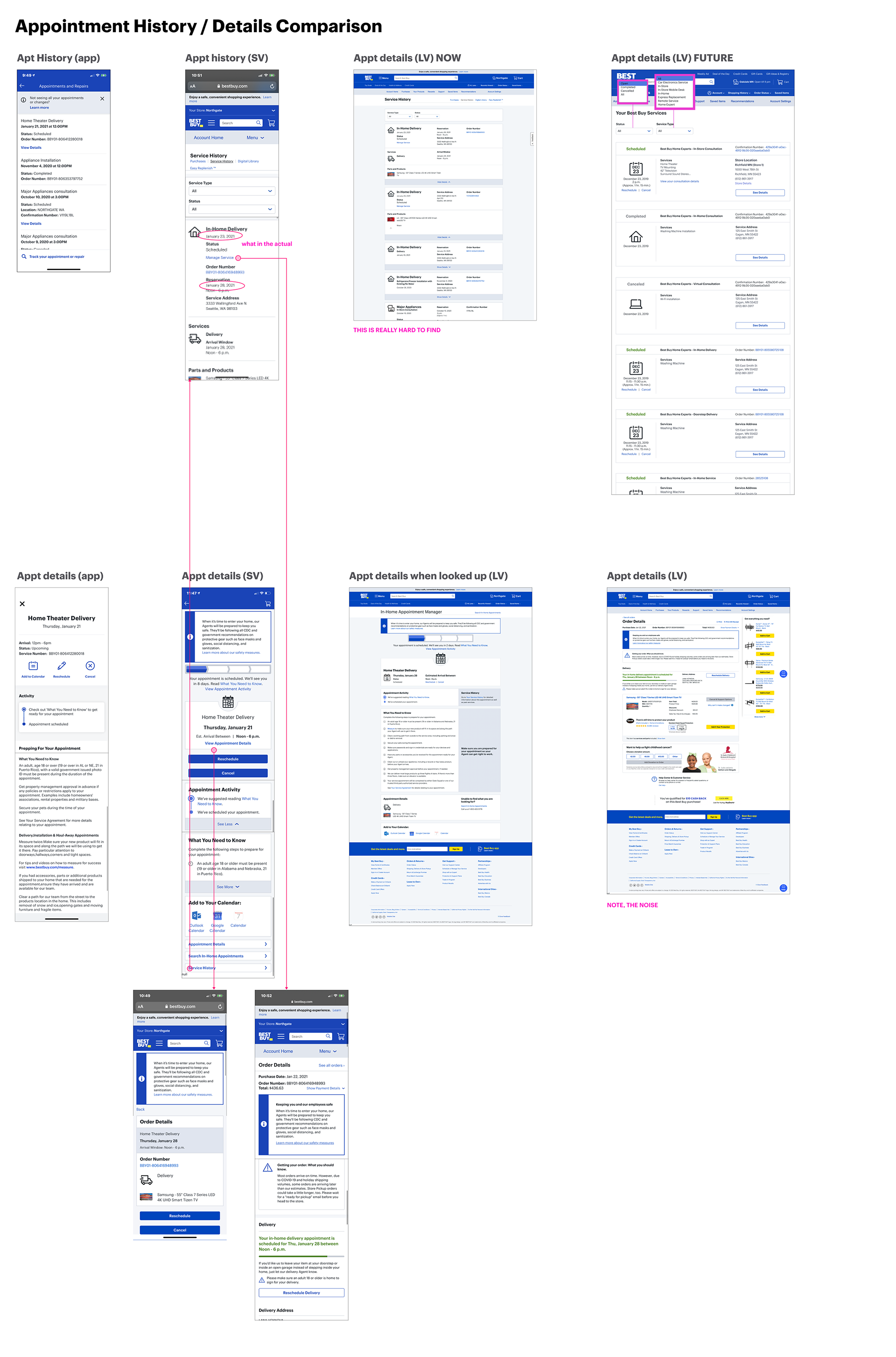
PDP — product detail page integration with delivery prep
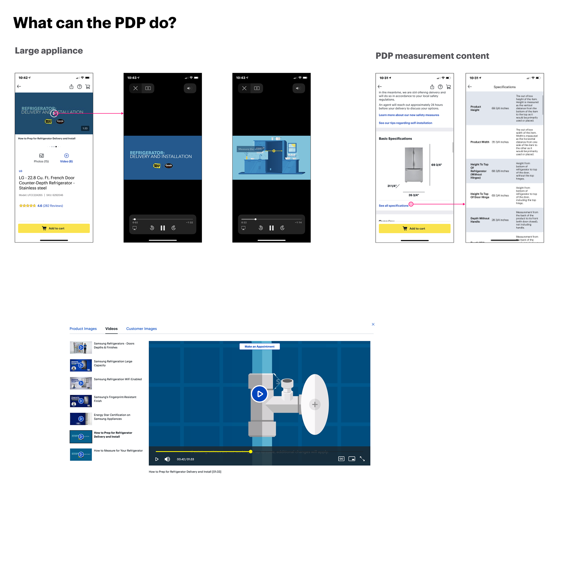
Post MVP — additional enhancements and scope expansion
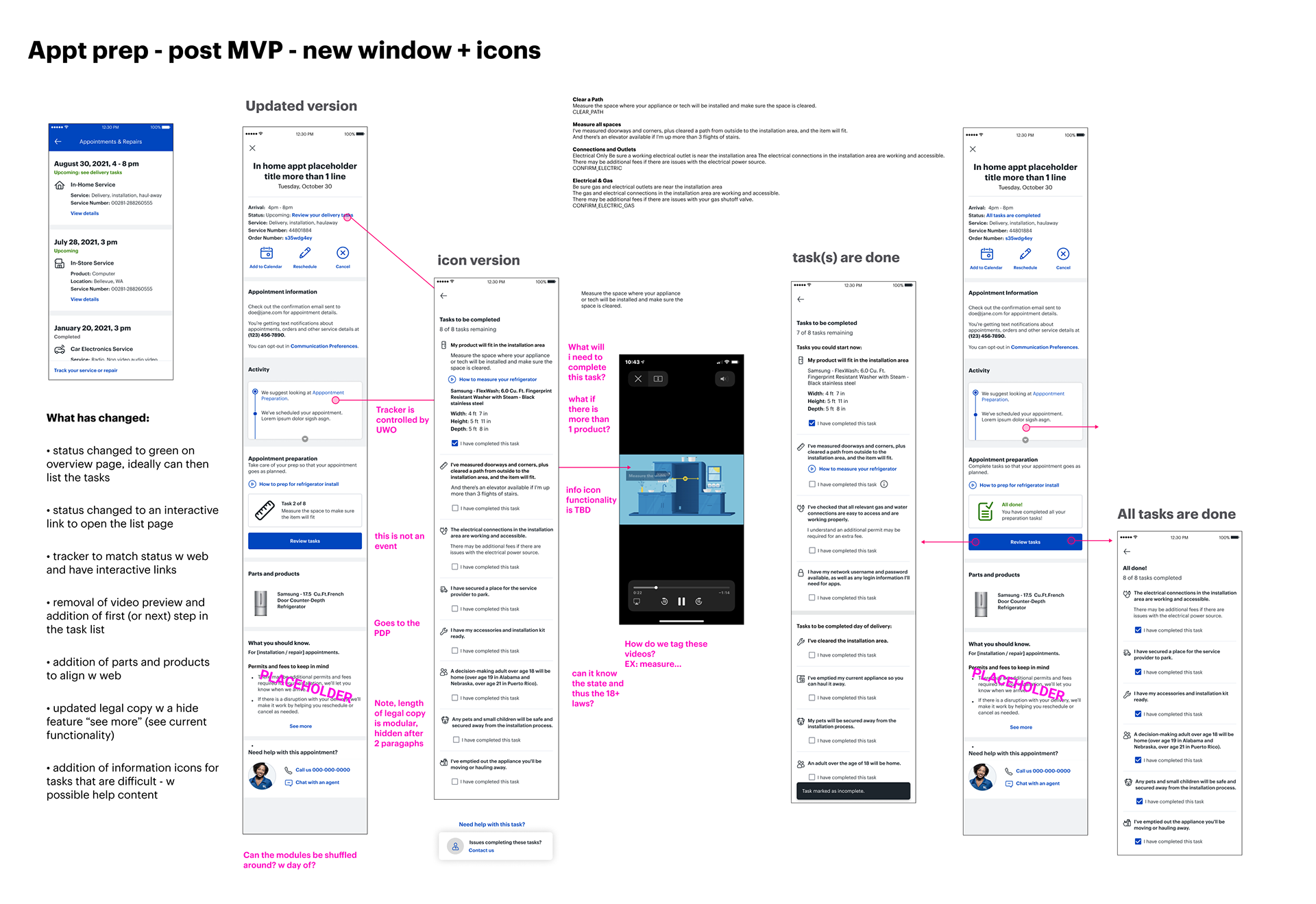
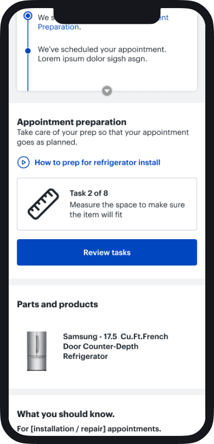
Final Design
Final design — appointment prep screen 1
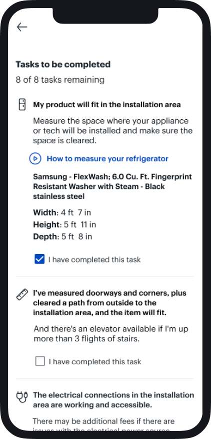
Final design — appointment prep screen 2
Outcome
The redesigned appointment preparation experience launched in the Best Buy app. By giving customers clear, visual, product-specific guidance before their delivery, the project helped reduce failed deliveries and contributed to saving the company up to $2M annually in rescheduling and service costs.