Filson · E-commerce UX · 2023
Navigation & cart overhaul
What is Filson?
Filson is a Seattle-based heritage outdoor brand founded in 1897 — known for rugged, high-quality gear built for the outdoors. Their products are built to last decades, with a devoted following among hunters, fishermen, and outdoor enthusiasts across the US and internationally.
Overview
As UX Lead at Filson, I owned the research and design effort to overhaul the site navigation, cart experience, and reintroduce the women's line — working alongside developers, content strategists, and brand stakeholders from audit through final design.
The Problem
A navigation built for a different era
Filson's navigation had grown organically over years — categories were inconsistent, the women's section was buried or absent entirely, and the cart created friction at a critical conversion point. Customers were dropping off before completing purchases, and the women's line relaunch had no clear home in the existing structure.
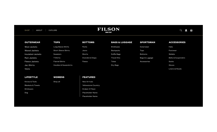
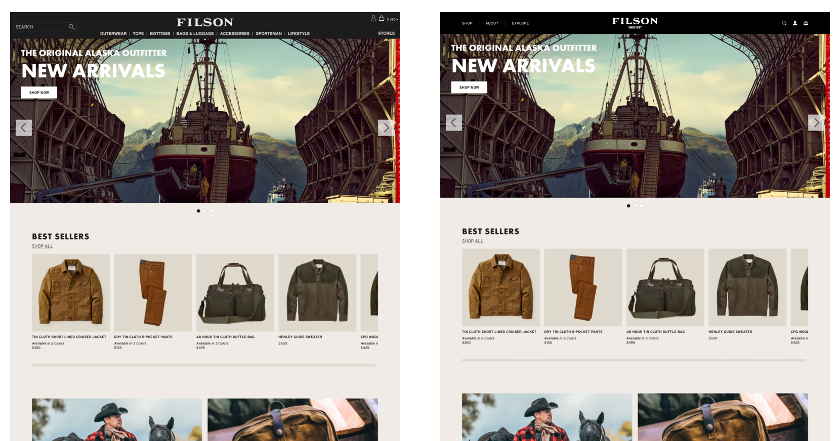
Navigation comparison — existing structure vs. proposed direction
Challenges
- Balancing the depth of Filson's product catalog with a clear, scannable navigation structure
- Creating a women's section that felt genuinely integrated — not bolted on
- Redesigning the cart without disrupting the existing checkout flow
- Working within Shopify's template constraints while pushing for a more custom feel
Research & Audit
Starting with what's actually there
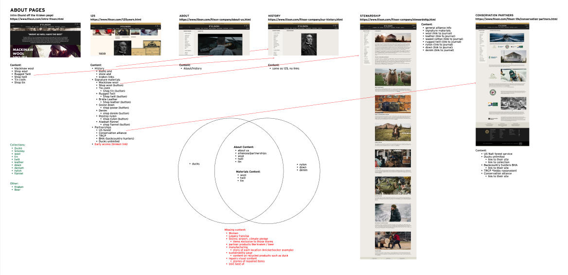
Before any wireframes, I mapped the full existing navigation structure and conducted user research to understand how customers actually moved through the site. The nav comparison below shows the gap between what existed and what was needed.
Site map — full content audit and IA restructure
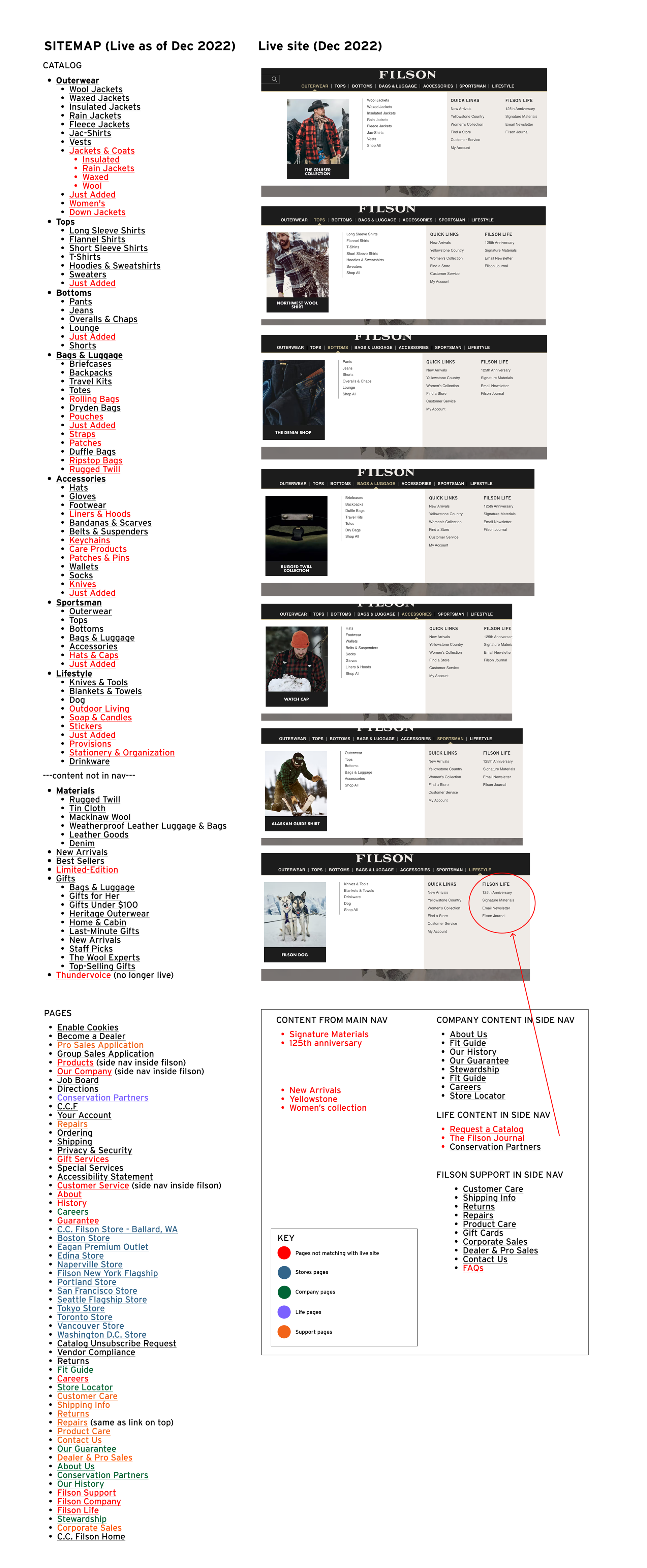
Site map outline — category hierarchy and depth mapping
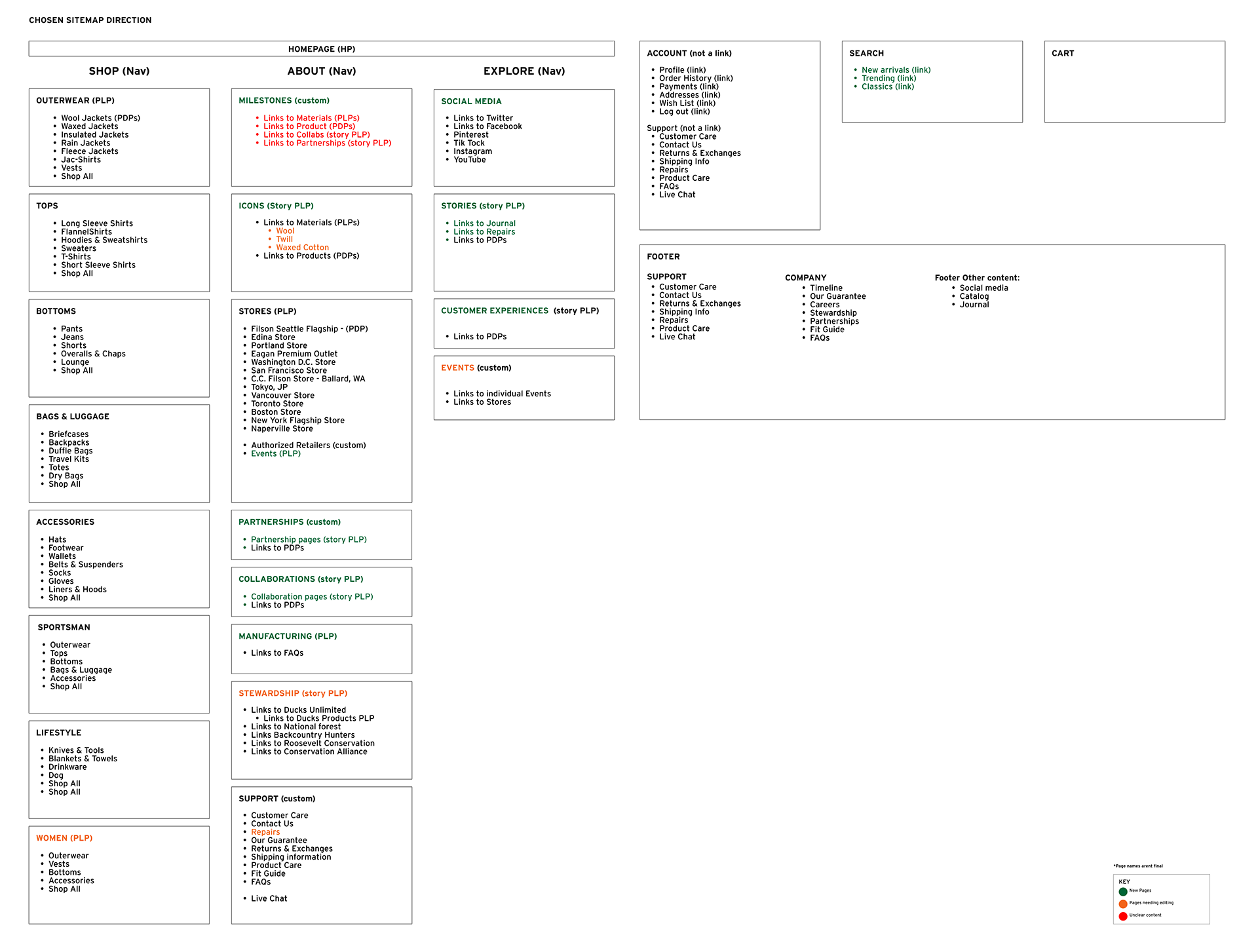
Telling a better story — how content strategy shaped the navigation decisions
Usability Testing
Testing with a fully functional prototype
I used usertesting.com to create a fully functional prototype on both desktop and mobile, complete with micro-animations in the navigation. We tested five key areas:
- Whether the new navigation would slow customers down on desktop and mobile
- Ability to find a particular category
- Ability to find a store
- Feedback on a visual search experience
- Feedback on the new Explore section and user expectations
Findings Summary
Below is an example of one of our key findings across the five tested areas.
| Questions | Success | Findings | Surprises | CX Notes |
|---|---|---|---|---|
| Shop — find a collaboration collection | Mostly Yes | Many looked on Home first but found this content | Most just wanted to use Search | Nav to collab with Home, and tighten UX copy |
| Shop — interest in backstory on products? | Mostly Yes | Relevant for niche / high cost / sustainability items | Not everyone cared for this content | Not all PDPs benefit from this content |
| About — find an event | Half / half | Most looked on Explore, took time to find Events | Stores + events don't have much association | Keep content on stores, but add events to Explore |
| About — interest in manufacturing processes | Mostly Yes | Relevant for a company like ours / part of sustainability | This is also a part of the sustainability story | Keep as is, visible in the nav, but needs content |
| Explore — interest in customers / stories | Yes | Easy to find, tho most opened it before hand | Lack of interest in music + campaign. A 'buffet' | UX copy edits, dynamic content, community |
| Search — interest in preview items | Mostly Yes | Preview seemed useful but not pertinent | Some missed it. Suggest personalization here | Lessen emphasis on review, be strategic in categories |
| Account — ability to find and edit a home address | Yes | As expected, but can be simplified | Order tracking was suggested as a flyout item | Pair down this and make it quick links style |
| Account — interest in personalization | Mostly No | Most people didn't care for this option | Personalization wasn't important | Most testers weren't VIP, but we can adjust later |
CX Takeaways
Research confirmed that the nav and homepage needed to work in sync — especially for collaborations and events, which customers expected to find on Home. Explore emerged as the natural home for Filson Life content: stories, community, and events. Account was utility-first with no appetite for personalization, and Search was heavily relied upon, signaling a need for smarter curation and category strategy.
New Navigation
Redesigned across all five sections
The new navigation was redesigned section by section — each with a clear content hierarchy, consistent depth, and a visual language that reflected Filson's brand. Below is a walkthrough of each section.
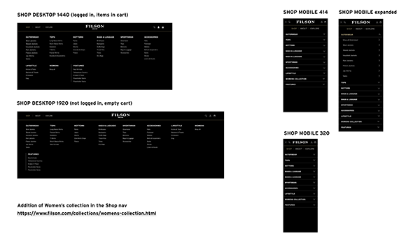
Shop — product categories with collaboration and women's line integrated
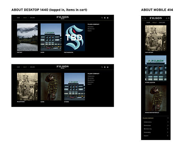
About — brand story, manufacturing, and sustainability
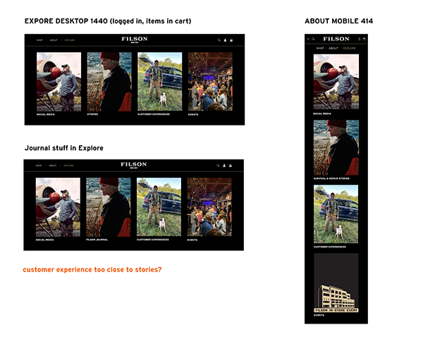
Explore — Filson Life, events, community stories
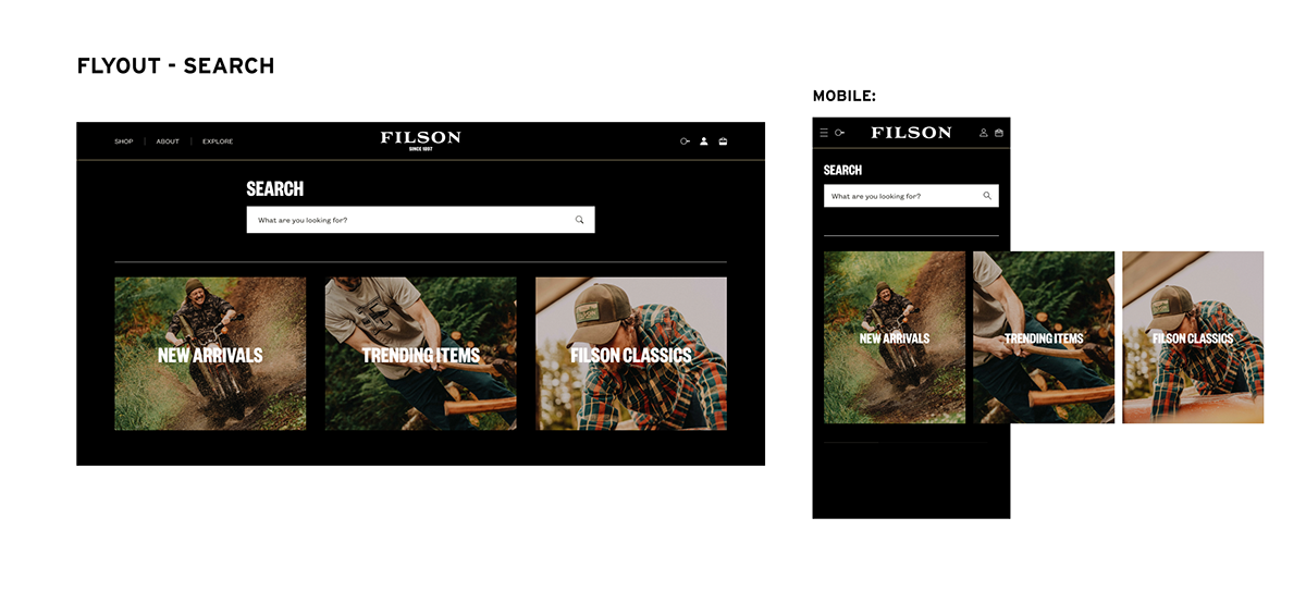
Search — preview items and curated category suggestions
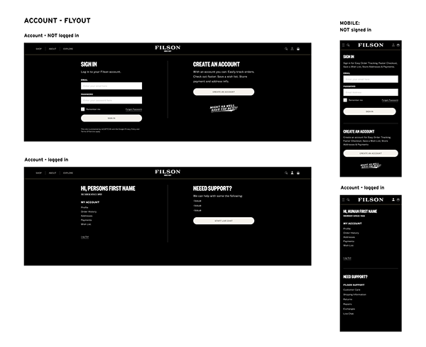
Account — utility-focused, quick links style
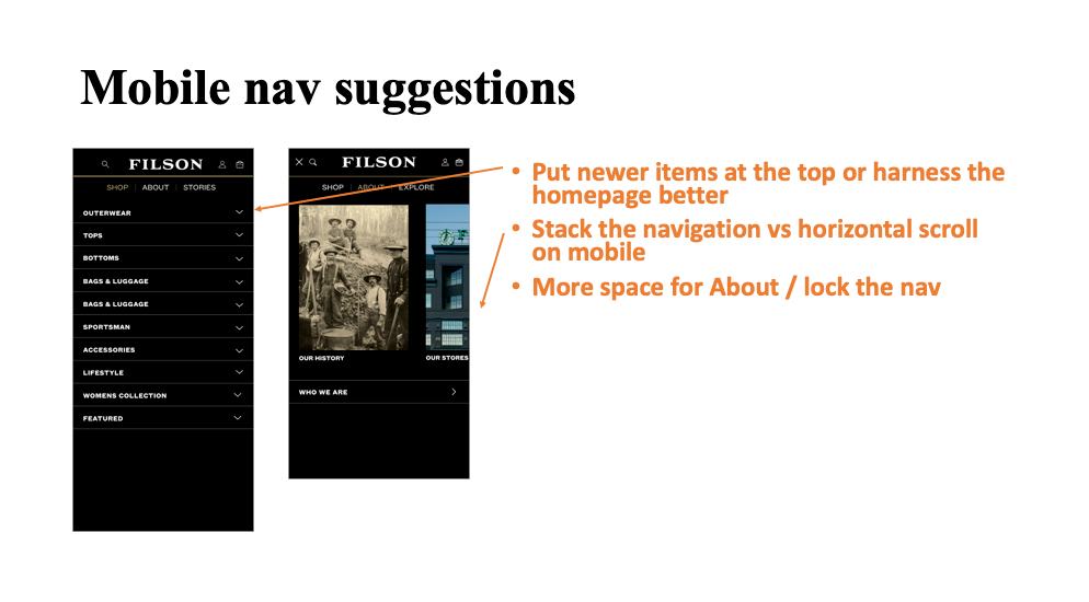
Mobile navigation — suggestions and approach
Cart Redesign
The cart as its own project
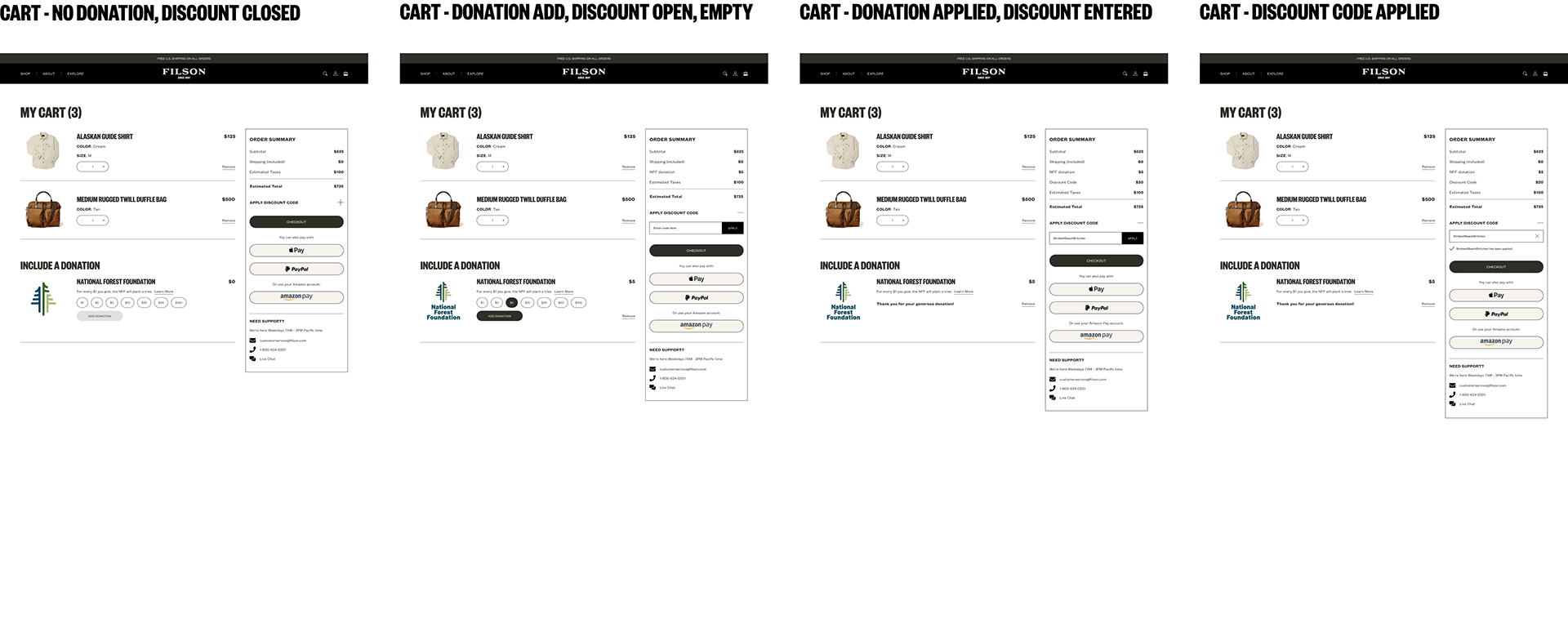
The cart redesign ran as a parallel workstream — complex enough in its own right to warrant dedicated focus. The core problems: customers couldn't verify product details without leaving the cart, upsell placement was interrupting the purchase decision, and the path to checkout had unnecessary friction.
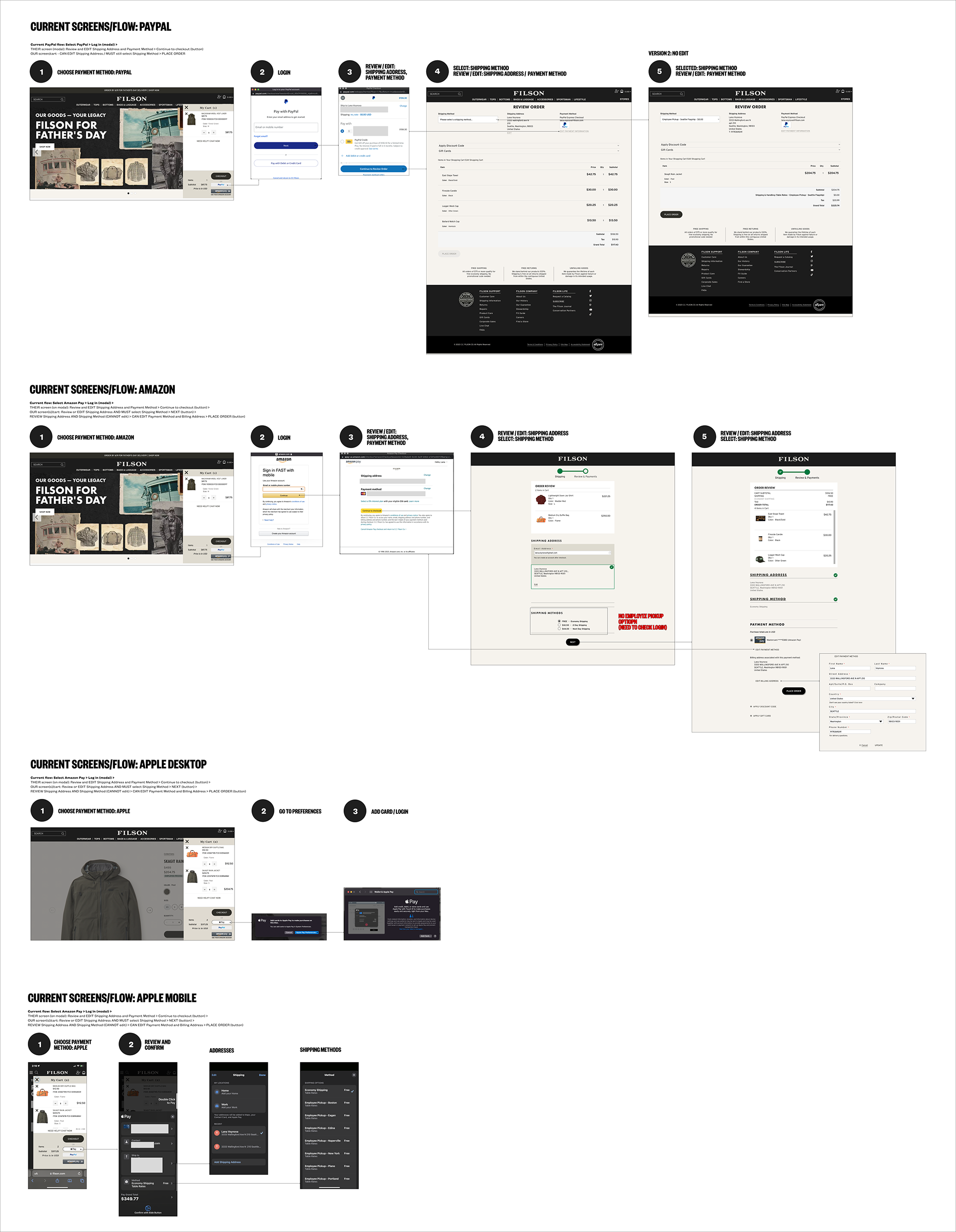
Previous user flows — mapping the existing cart journey and failure points
Working through iterations — exploring layout and content approaches for the redesigned cart
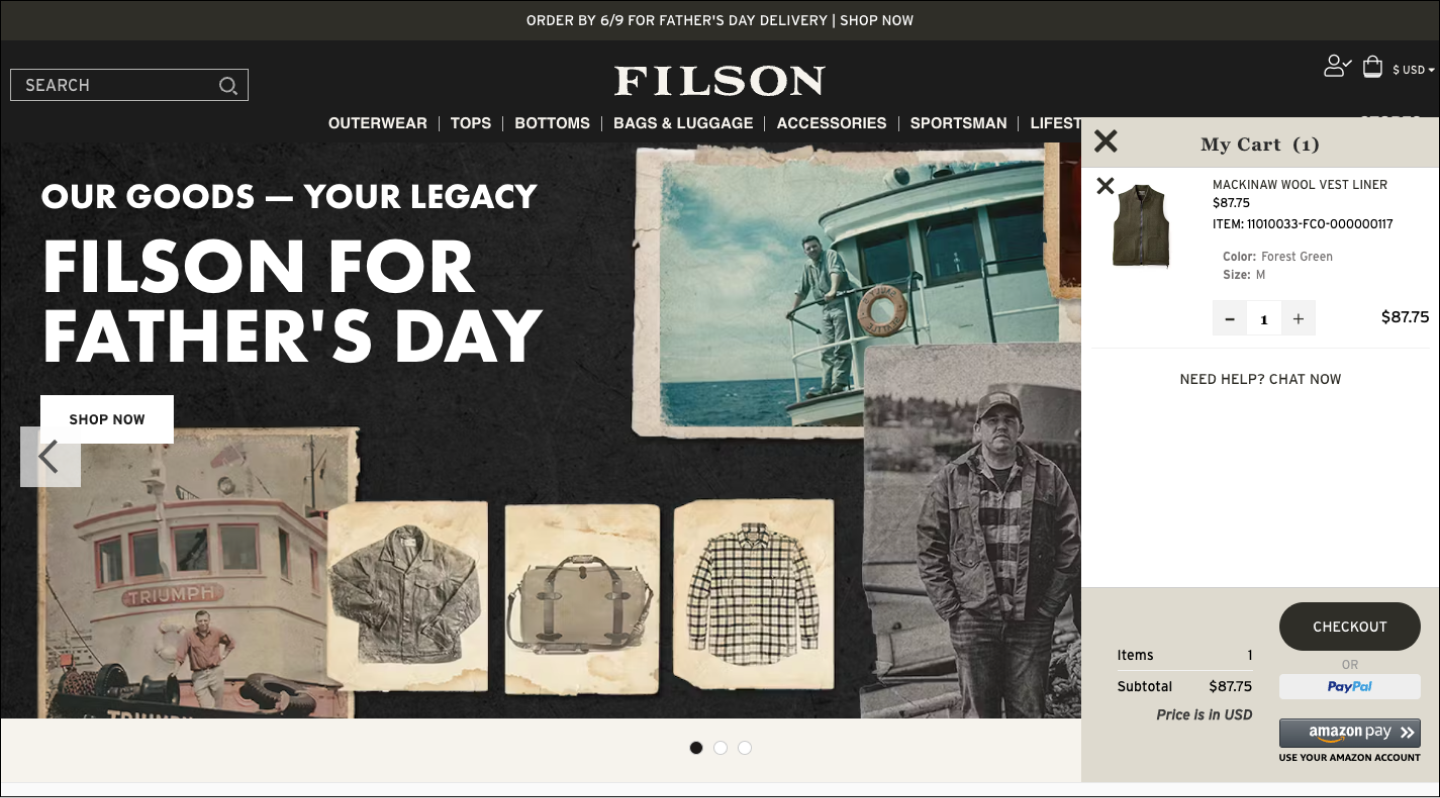
Before — original cart
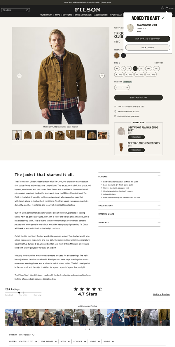
After — redesigned cart
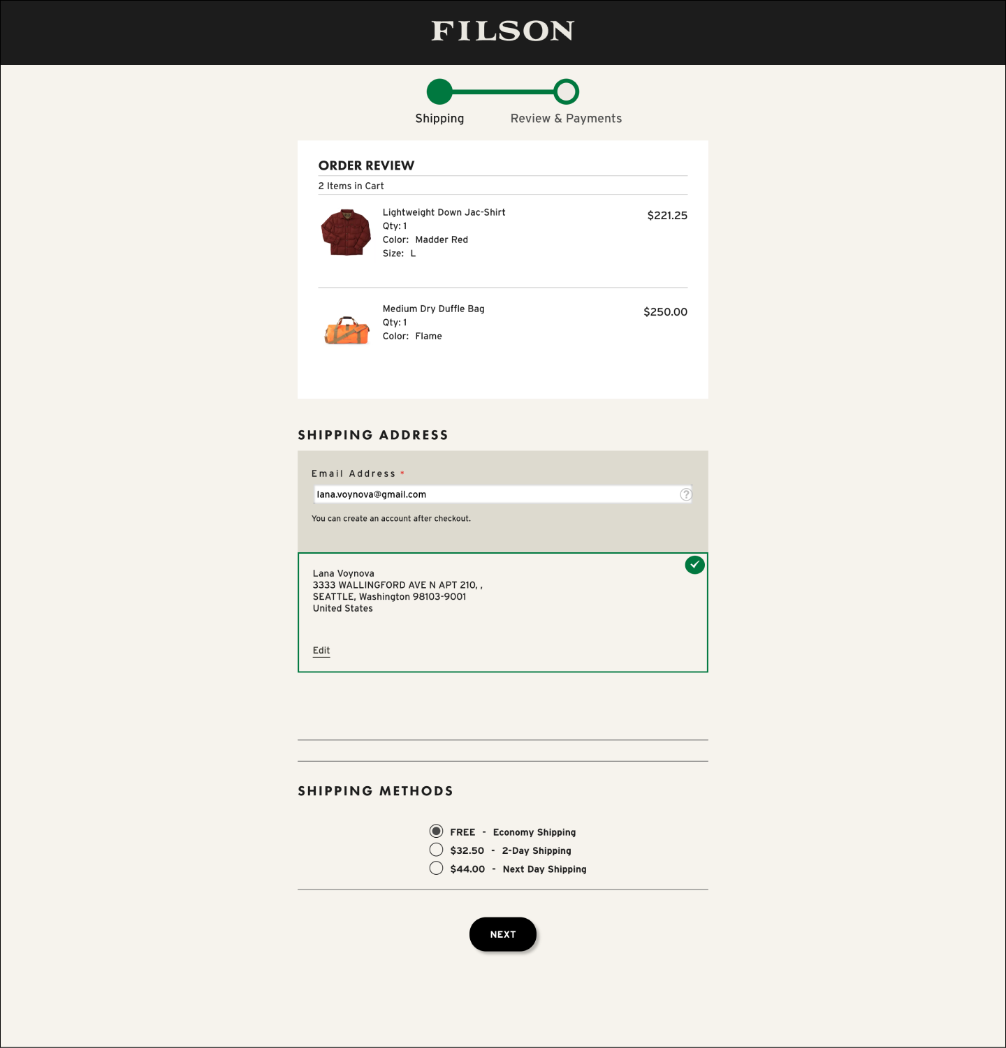
Before — original cart landing
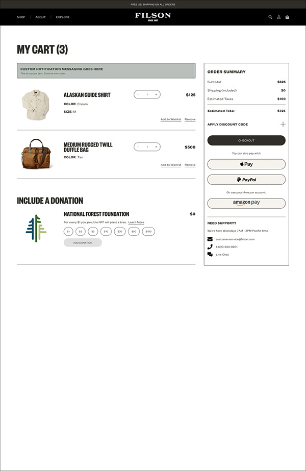
After — redesigned cart landing
Outcome
The redesigned navigation and women's section launched in 2023. The women's line is now a prominent, equal part of the Filson nav structure — visible on the live site today. The cart redesign reduced friction at checkout, and the template and component work built for this project was reused across partner and collaboration pages.