MRY / LBI · Johnson & Johnson · 2013
Tylenol.com redesign
What is Tylenol?
Tylenol is one of Johnson & Johnson's most recognized consumer brands — a leading over-the-counter pain reliever used by millions of people worldwide. The redesign was a $1M engagement to modernize the brand's digital presence across a full product portfolio, with the new design serving as a template across the J&J portfolio.
Overview
As UX Designer at MRY / LBI, I worked as part of a cross-functional team to redesign Tylenol.com — delivering a mobile-friendly, brand-forward experience organized around how customers actually think about their symptoms and needs, not how J&J organized their product lines internally. The redesigned site served as a long-term template across the Johnson & Johnson portfolio.
The Problem
A site organized for the company, not the customer
The original Tylenol.com was organized by product line — which made sense internally but created friction for customers who thought about their needs by symptom ("I have a headache") not by product ("I need Tylenol Extra Strength"). The site also wasn't mobile-friendly and didn't reflect the warmth and trust the Tylenol brand was known for.
Research & IA
Restructuring around the customer's mental model
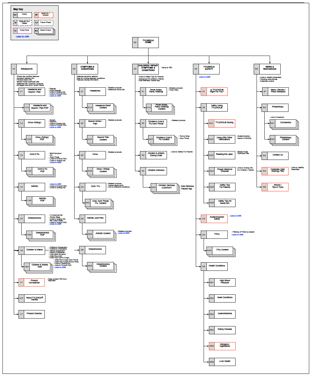
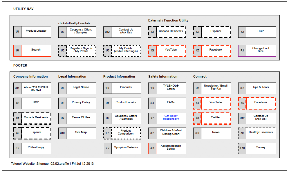
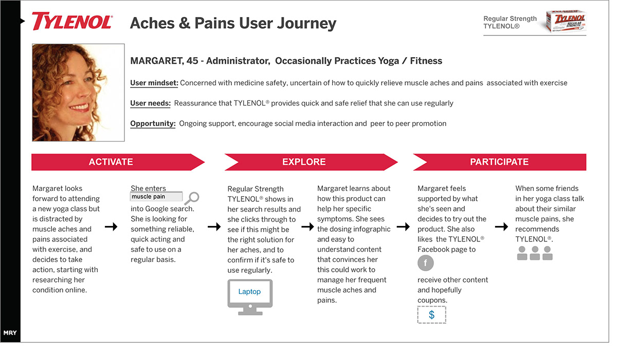
Working from search data and Google Analytics, I built user journeys organized by product line and symptom — understanding how customers arrived at the site and what they were actually looking for. The sitemap was restructured to lead with products, symptoms, and children's/infants content, with Safety moved out of the utility nav where it had been buried.
Sitemap — overview and IA restructure, part 1
Sitemap — overview and IA restructure, part 2
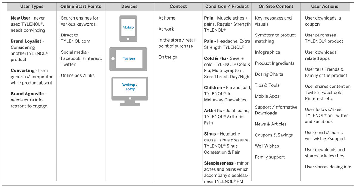
Content matrix — multi-device, multi-location access planning
User journey — symptom-based navigation path
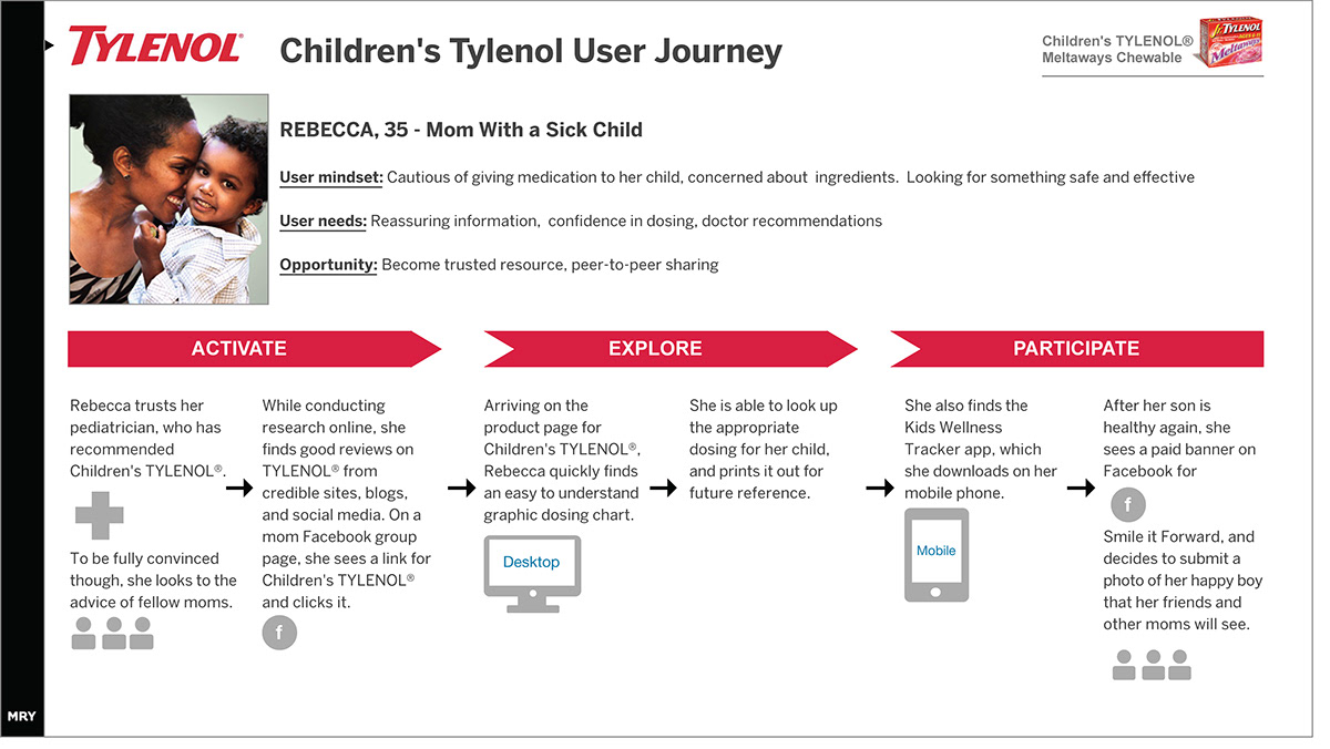
User journey — product-based navigation path
Design Process
From sketching to responsive wireframes
Navigation sketches — exploring layout and hierarchy
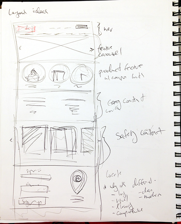
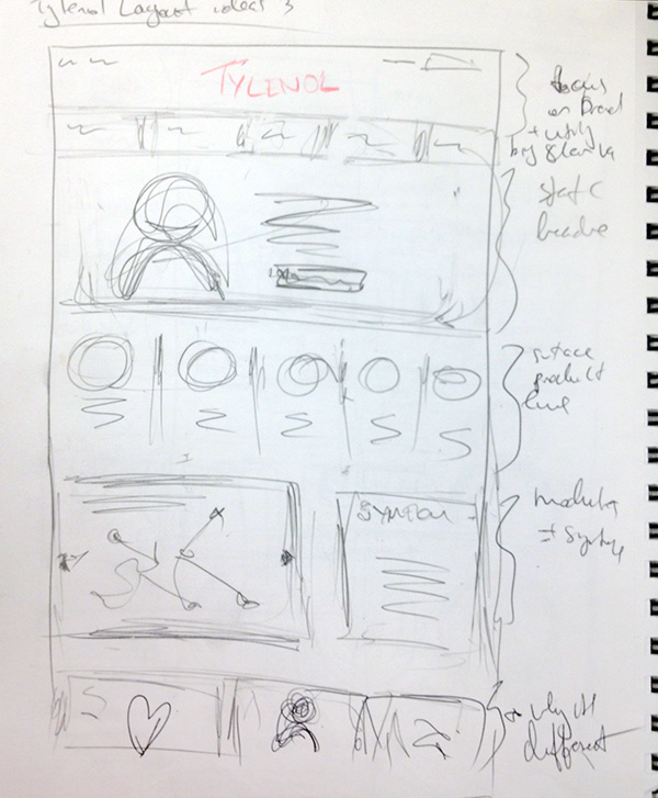
Homepage sketches — content hierarchy exploration
Logo placement sketches — exploring centering vs. left-aligned approaches
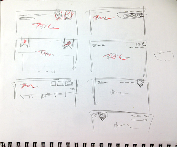
Logo placement — refined direction
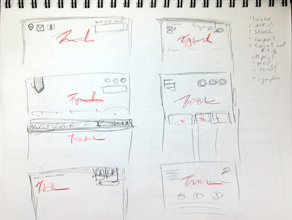
Responsive wireframes — desktop, tablet, and mobile layouts

Before & After
From product-first to customer-first
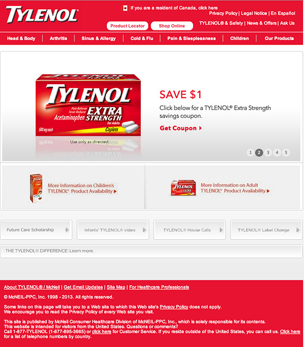
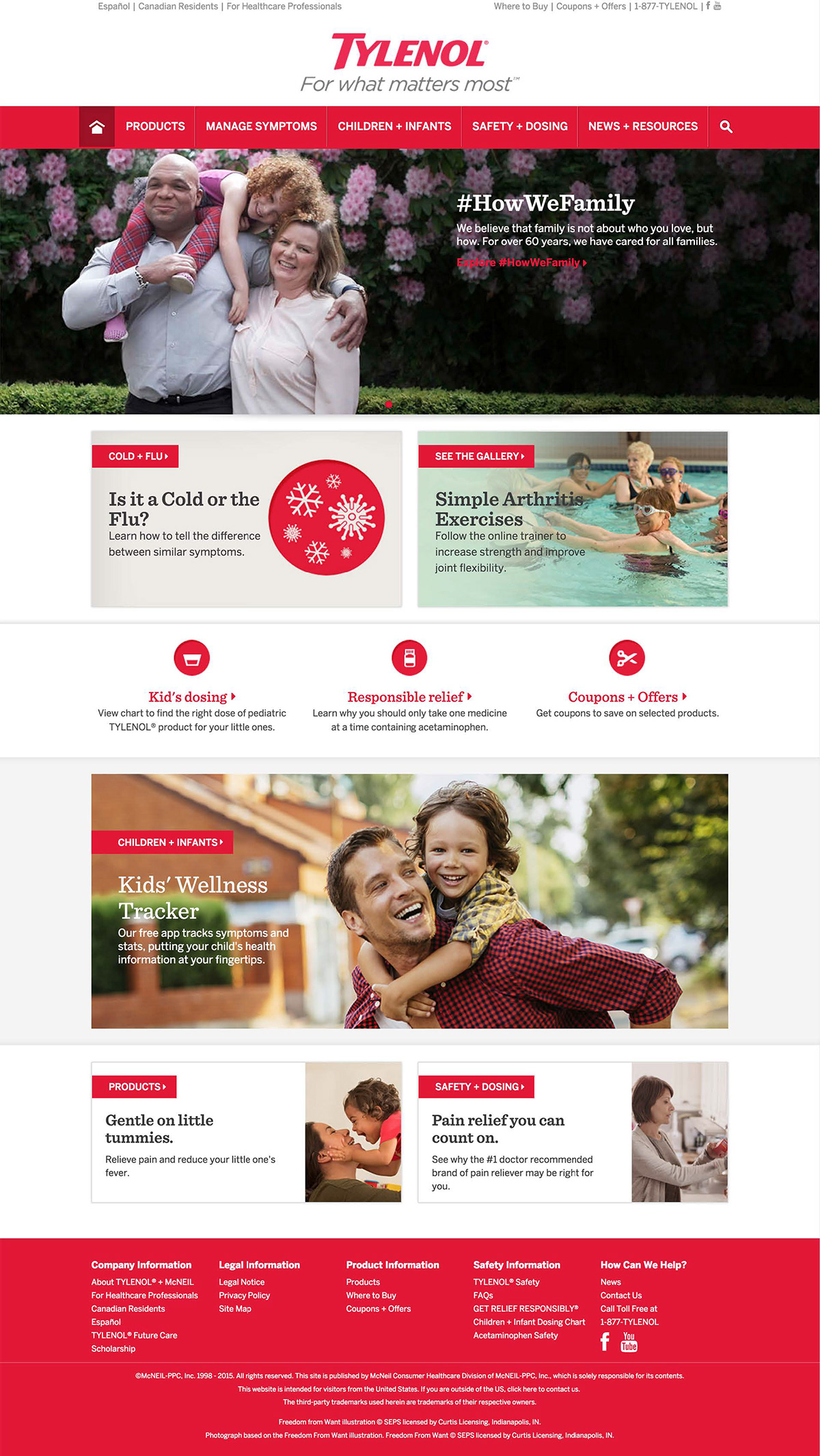
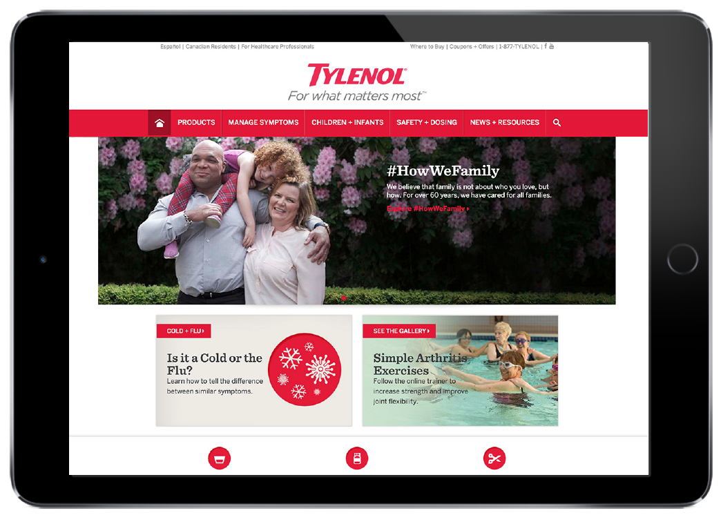
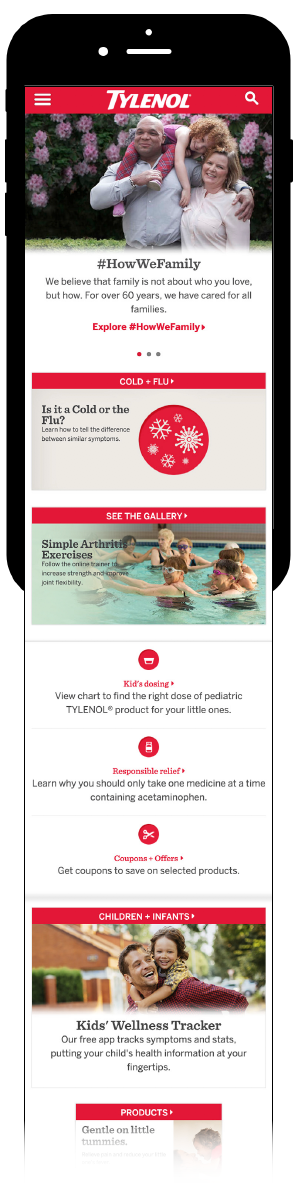
The original site led with product lines and lacked the warmth the Tylenol brand was known for. The redesign led with symptoms, brought in editorial content, and created a mobile-friendly experience that reflected genuine brand trust.
Before — original Tylenol.com homepage
After — redesigned Tylenol.com homepage
After — tablet experience
After — mobile experience
Outcome
The redesigned Tylenol.com launched and served as a long-term template across the Johnson & Johnson portfolio — demonstrating the scalability of the IA and design system. The client kept the site for years, validating the structural decisions made during the engagement.