Honeywell · Enterprise UX · 2018
AutoCube product launch & data dashboard
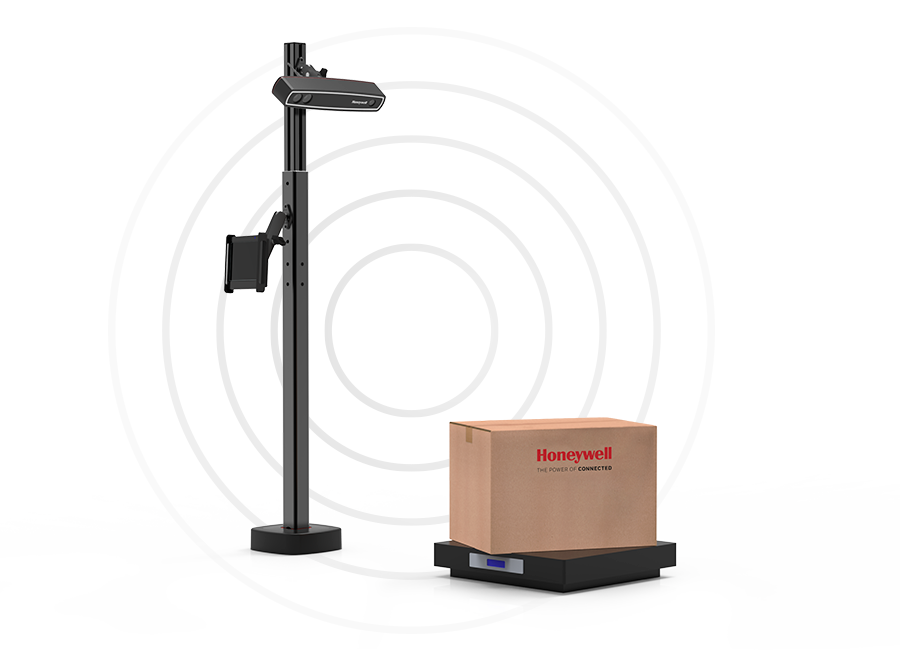
What is AutoCube?
AutoCube is a 3D depth-sensing dimensioning device by Honeywell — designed to instantly and accurately measure the dimensions of any object in a distribution center or warehouse setting. It replaced manual measuring processes (tape measures, physical boxes) with automated, real-time data capture.
Overview
As Senior Interaction Designer at Honeywell, I led UX across four deliverables for the AutoCube product launch: a PC app for device management and registration, a real-time data dashboard, and a marketing site — all designed to support a new product entering the market with no existing design system or established user base.
The Problem
Measuring used to look like this
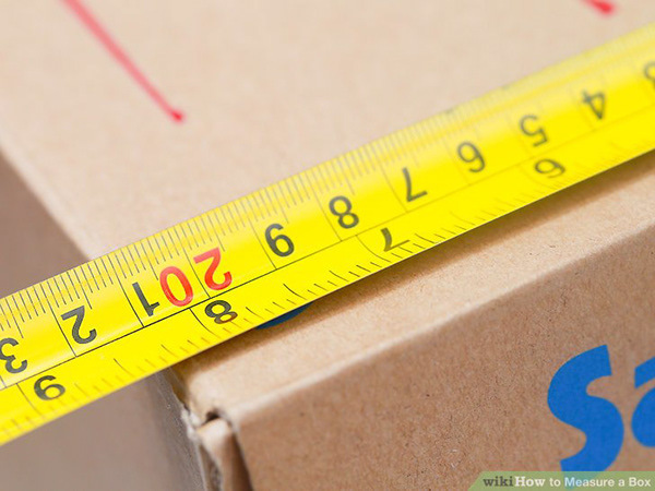
Distribution center workers were manually measuring packages with tape measures and physical reference boxes — slow, error-prone, and inconsistent across locations and shifts.
AutoCube automated this entirely. The design challenge was making a complex, data-heavy system feel approachable for floor workers and managers alike — people who needed answers fast, not another complicated tool.
Research & Discovery
Understanding the ecosystem before designing anything
Storyboard sketch — mapping the AutoCube use case in context
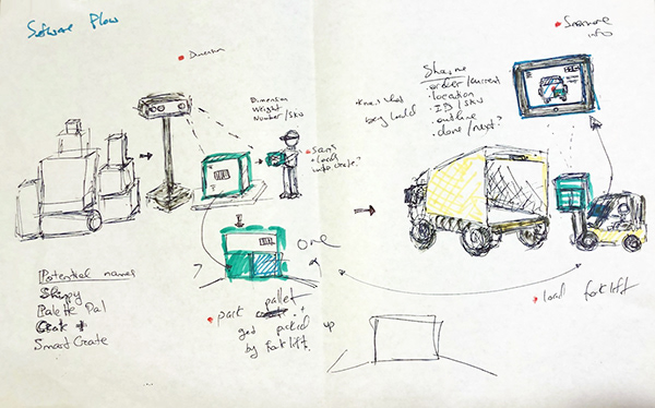
User story sketch — understanding how different roles interact with the device
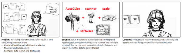
Customer journey — end-to-end experience from setup to daily use
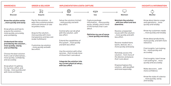
Ecosystem flow — how AutoCube connects to the broader DC infrastructure
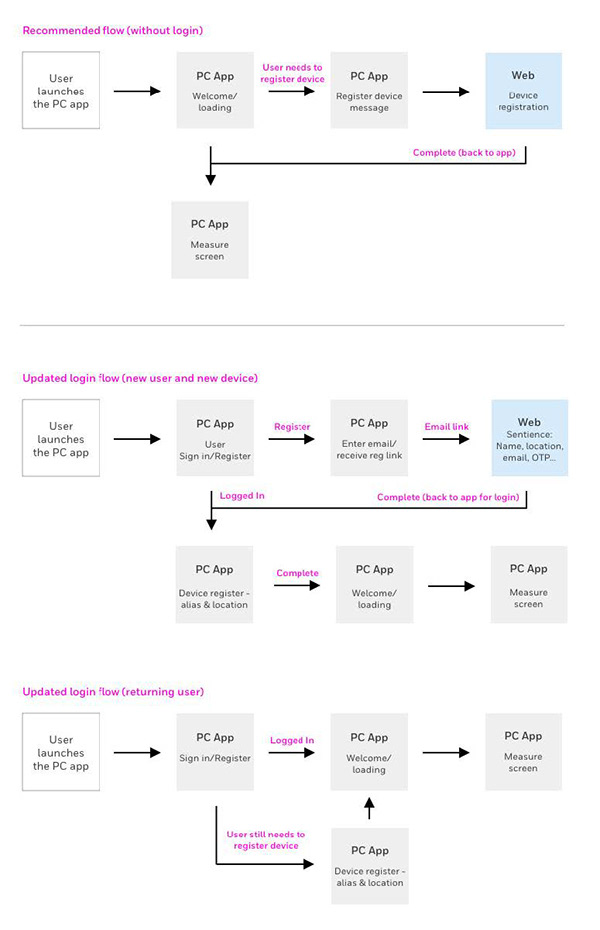
PC App — Registration Flow
Before & after: simplifying device registration
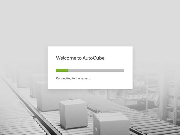
The existing registration flow was complex and error-prone. I mapped it in four steps to understand where it was failing, then redesigned it from scratch.
Current flow
Step 1 of 4 — current registration flow
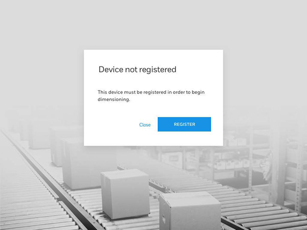
Step 2 of 4 — current registration flow
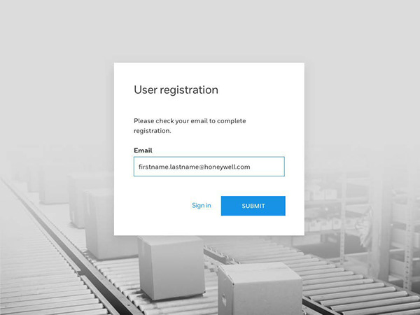
Step 3 of 4 — current registration flow
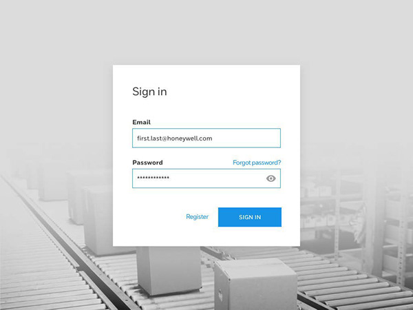
Step 4 of 4 — current registration flow
Redesigned flow
Redesigned registration — screen 1 of 6
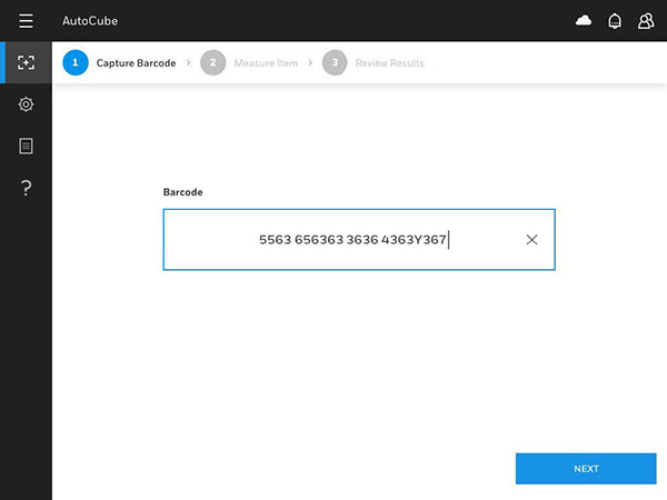
Redesigned registration — screen 2 of 6
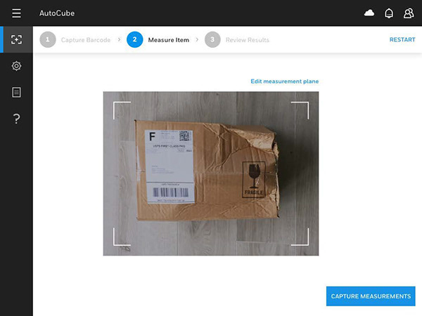
Redesigned registration — screen 3 of 6
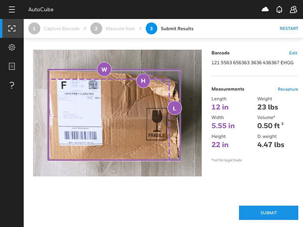
Redesigned registration — screen 4 of 6
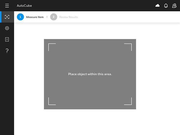
Redesigned registration — screen 5 of 6
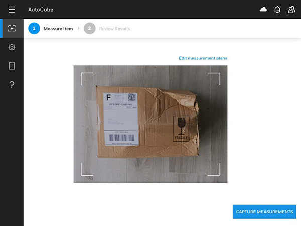
Redesigned registration — screen 6 of 6
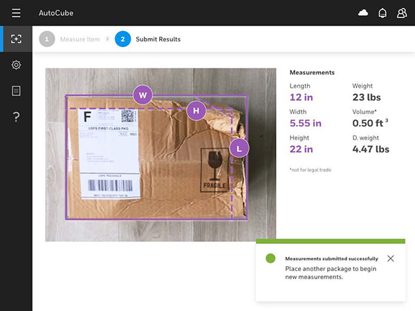
PC App — Settings
Customized settings screens
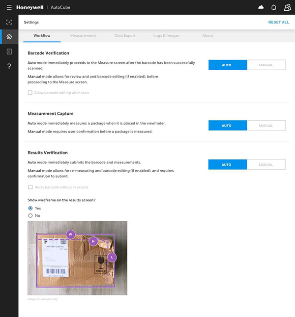
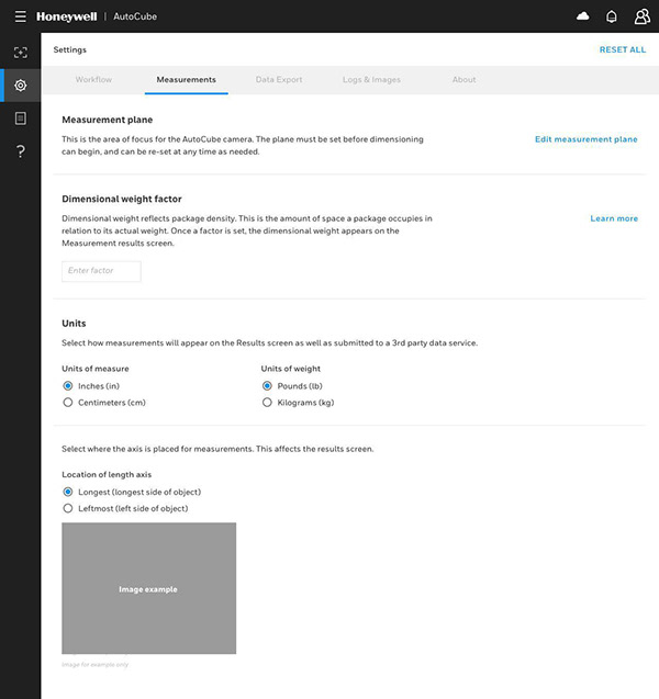
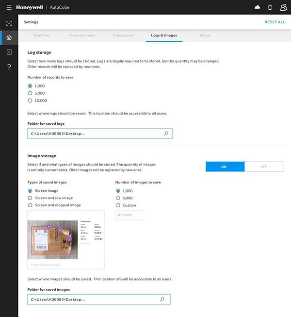
Designed three customized settings screens tailored to different user roles and configuration needs — each balancing complexity with clarity.
Settings — Workflow
Settings — Measurements
Settings — Logs
PC App — Data Export
Getting the data out
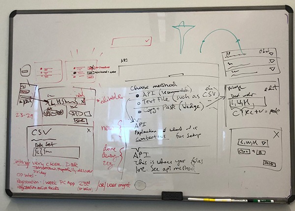
Designed the data export experience — from the settings entry point through the modal flow. I worked closely with our strategist to make sure we had all the right content. The whiteboard sketch shows the early thinking before moving to screen design.
Whiteboard sketch — data export flow
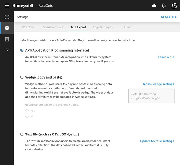
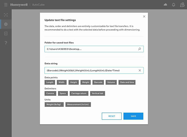
Settings entry point → modal opens
Data Dashboard
Displaying data at scale
Dashboard sketch — exploring data display approaches
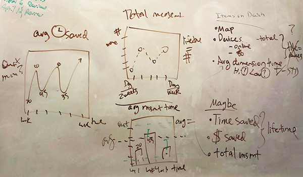
Dashboard sketch — layout iteration
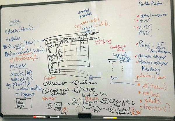
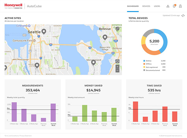
Final dashboard design — active sites, measurements, money saved, time saved
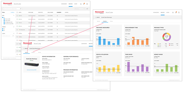
Device monitoring — ways to track and manage AutoCube devices in the dashboard
Marketing Site
Bringing the product to market
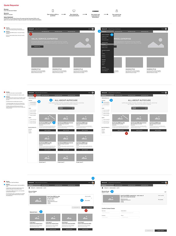
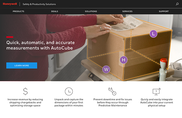
Alongside the app and dashboard, I designed a marketing site to support the product launch — giving potential customers a clear picture of what AutoCube does and how to get started.
Marketing site — wireframe
Marketing site — final design
Outcome
AutoCube launched with a complete suite of UX — registration app, data dashboard, and marketing site — all designed from scratch for a new product entering the market. The device was actively used in distribution centers until it was discontinued in 2022.