Honeywell · Enterprise UX · 2019
Designing for the distribution center floor
What is Honeywell SPS?
Honeywell Safety and Productivity Solutions (SPS) makes hardware and software for industrial environments — warehouses, distribution centers, manufacturing facilities. Their products help large operations manage throughput, safety, and inventory in real time. The division was later acquired in a $1.5B deal, with the software platform as a key part of the value proposition.
Overview
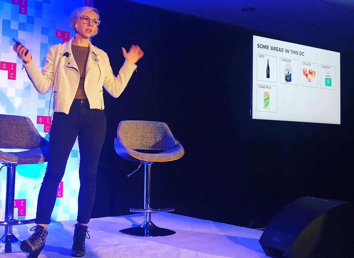
As Senior Interaction Designer at Honeywell, I designed a real-time data dashboard for large distribution center operations — working directly onsite with stakeholders across multiple facilities. I partnered with a researcher throughout, combining qualitative insights with behavioral data to ground every design decision. This work was later presented at the Seattle Design Conference — "Where Is My Order? Designing for Distribution Centers."
The Problem
Twelve stakeholders. Twelve different definitions of success.
Distribution center clients were operating with fragmented data — throughput in one system, safety in another, sales somewhere else. Operators were making decisions based on incomplete pictures. In a DC, a dashboard that's wrong or slow has real operational consequences. We had to earn trust with each stakeholder group before we could design anything.
Challenges
- Working with over a dozen stakeholders across multiple sites, each with different priorities and success metrics
- Designing for a non-traditional context — noisy, fast-paced environments where screens are glanced at, not studied
- Knowing when to stop iterating — the project had no clean end state, just incremental improvement
- Balancing custom design needs with what the data systems could actually surface in real time
Research — Workshops
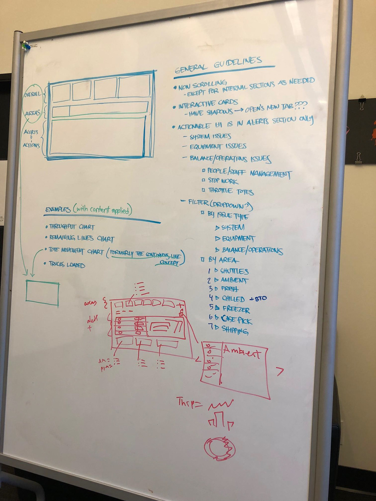
Get to know the content, workshop it
I traveled to distribution center sites with our lead researcher to observe operations firsthand — watching how staff used existing tools, what they ignored, and what they reached for when things went wrong. On-site workshops with stakeholders across roles surfaced their actual data needs, not what they thought they needed.
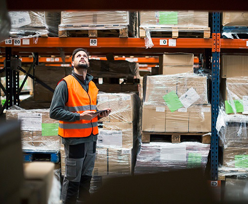
Onsite research workshop — DC facility
The real environment — fast-paced, high-stakes, data-heavy
Personas
Two roles, two very different needs
We identified two primary personas — each with distinct data priorities, time horizons, and decision-making patterns. These grounded every design decision that followed.

Control Tower Manager
Strategic oversight
- Needs a high-level view across the entire facility
- Focused on throughput trends and daily targets
- Makes decisions that affect shift planning and resource allocation
- Needs to escalate issues quickly to leadership
Operations Floor Supervisor
Real-time operations
- Needs granular, real-time data for their specific area
- Focused on safety alerts and immediate problem resolution
- Works on the floor — needs glanceable, not dense information
- Coordinates directly with workers and equipment operators
Content is King
What you show matters as much as how you show it
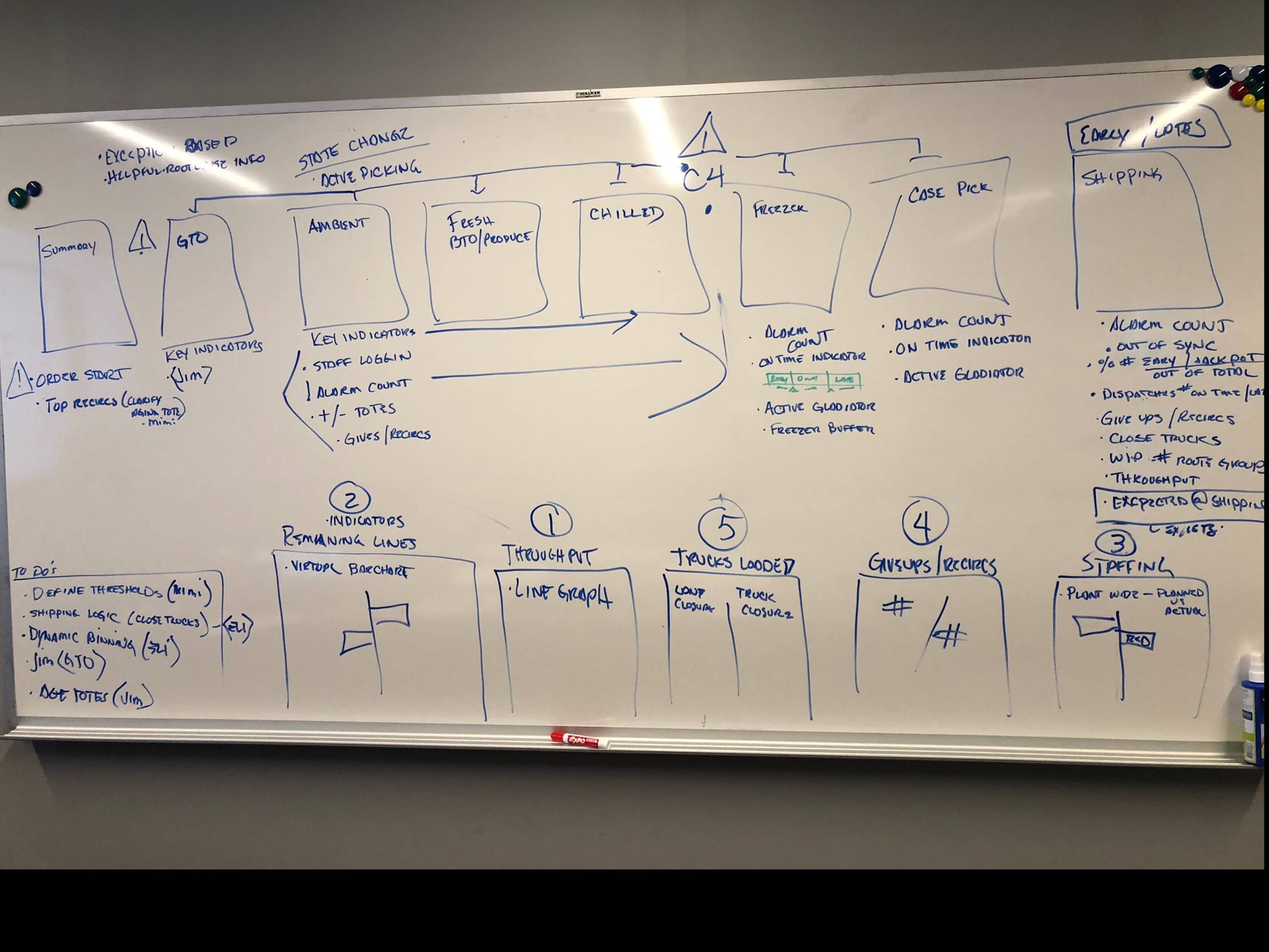
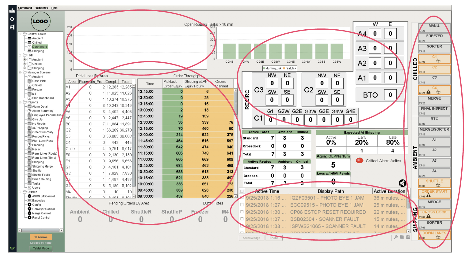
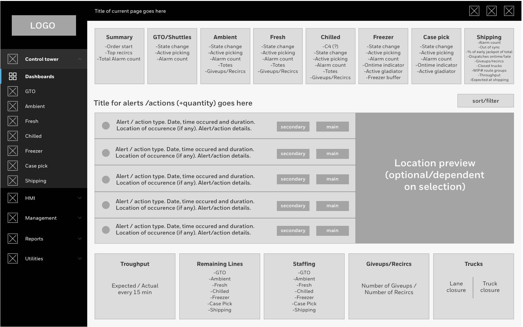
Before any visual design, we had to agree on what content actually needed to be on the dashboard. More data isn't better data. We audited the existing dashboard, identified what was missing, and mapped the DC floor layout against the data hierarchy to understand what operators needed at a glance vs. on demand.
Existing dashboard — fragmented, dense, not role-specific
Dashboard wireframe explorations
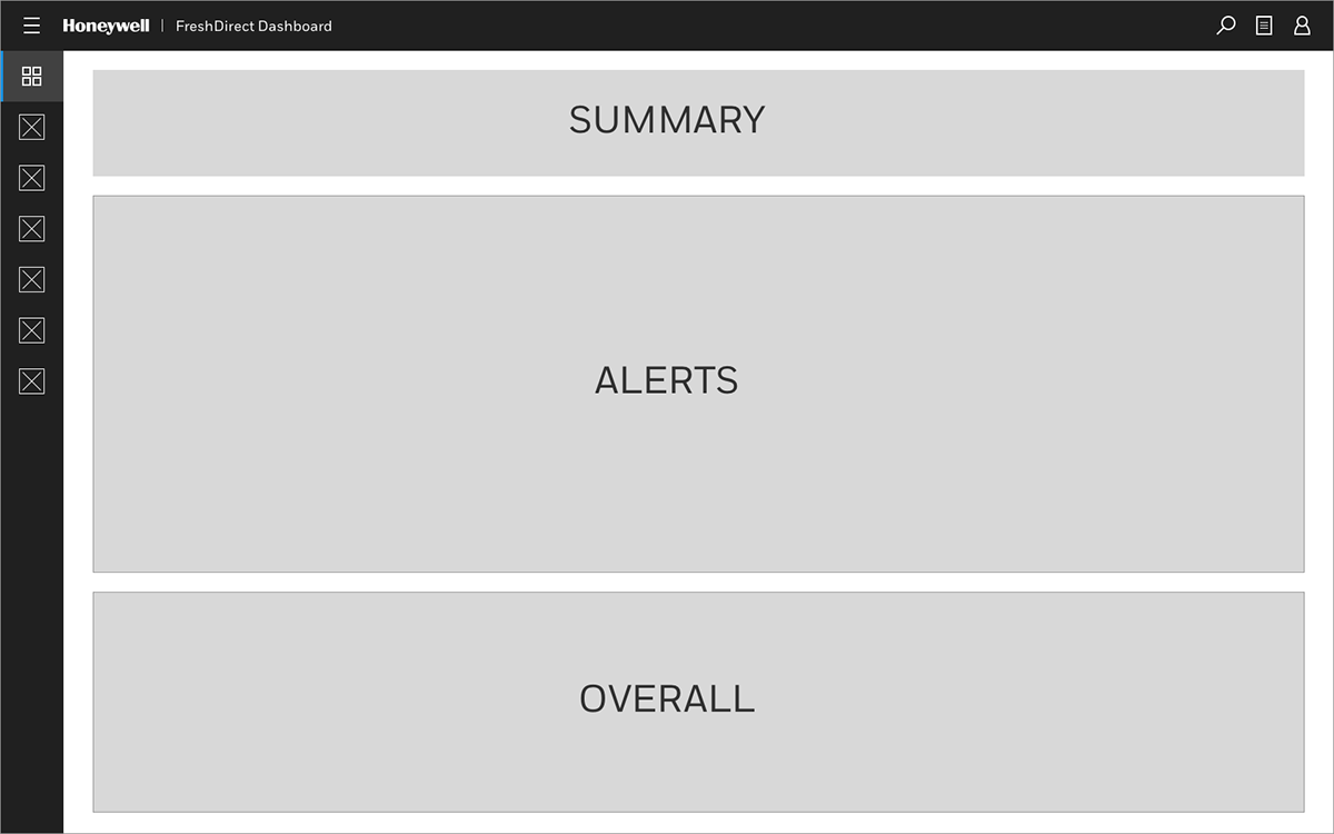
Layout framework — prioritizing status visibility over data density
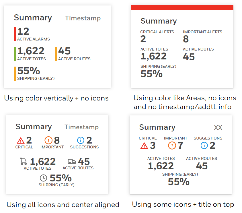
Summary exploration — different ways to convey information at a glance
Houston, We Have a Problem — Alarm Design
Alarm fatigue is real
Too many alarms means operators stop responding to them. We needed a tiered alarm system with clear visual hierarchy, sortability, and the ability to quickly triage by severity — without adding cognitive load to people already managing complex operations.

Before — original alarm area
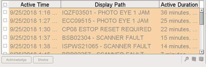
Before — alarm detail view
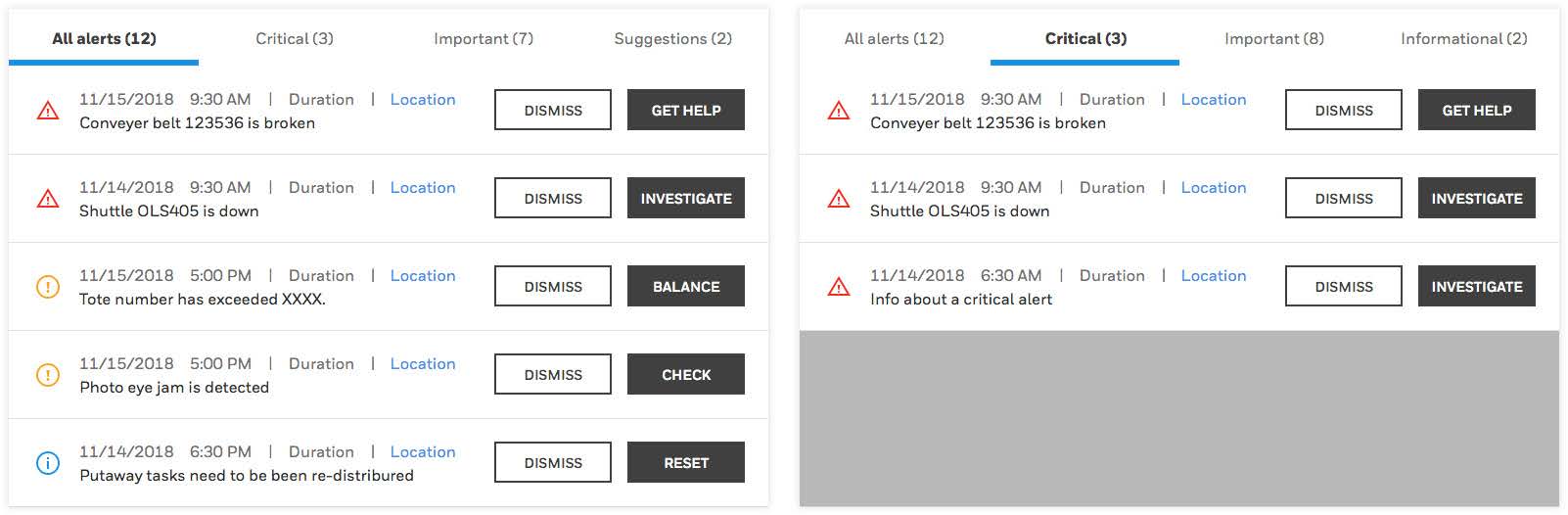
After — tiered alarm panel, sortable and triageable
Iterate
No clean ending — just better versions
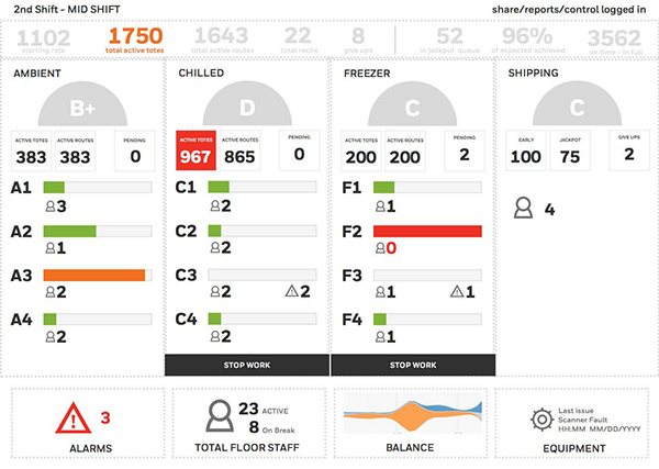
The project didn't have a clean end state. Each round of stakeholder feedback surfaced new edge cases, new data requirements, new contexts we hadn't designed for. The discipline was knowing which feedback to act on and which to defer. Below are four dashboard explorations from across the iteration cycles.
Dashboard exploration 1
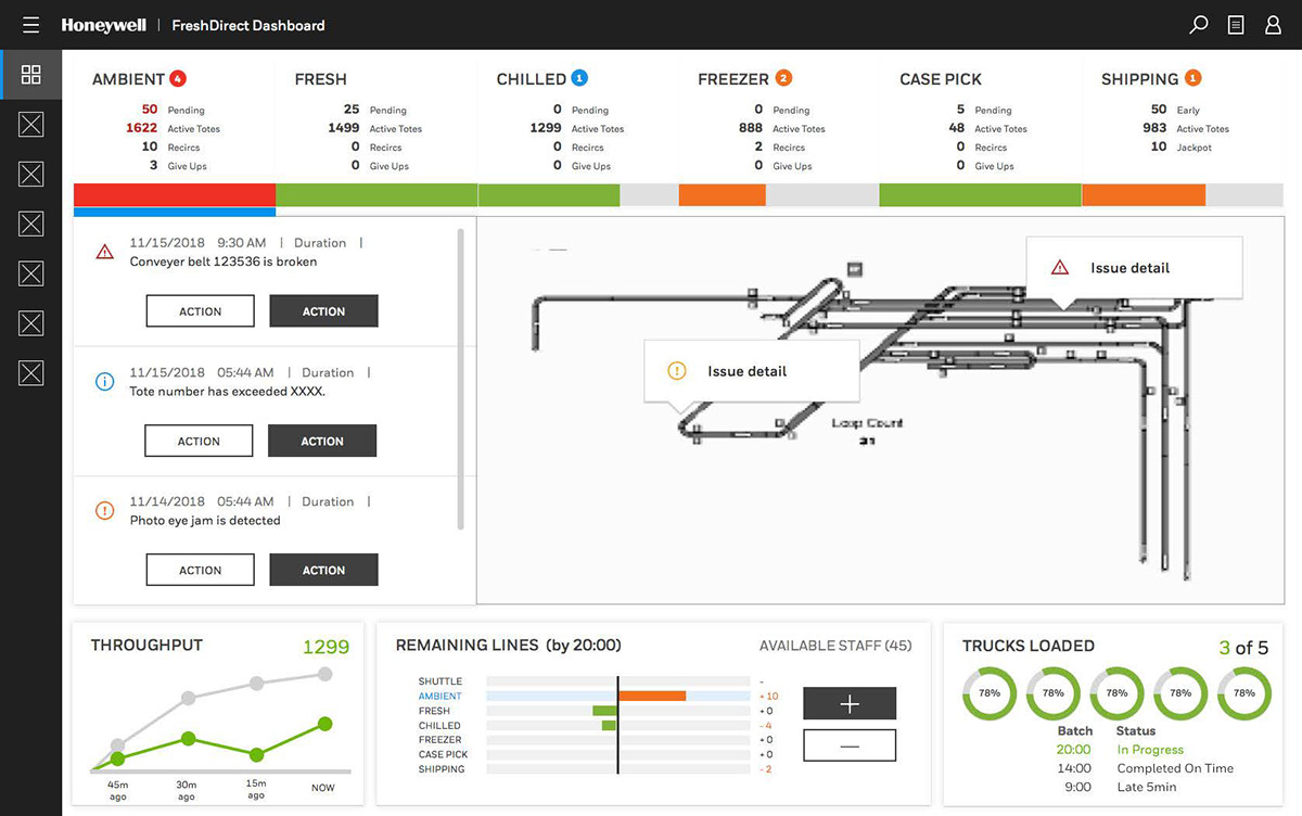
Dashboard exploration 2
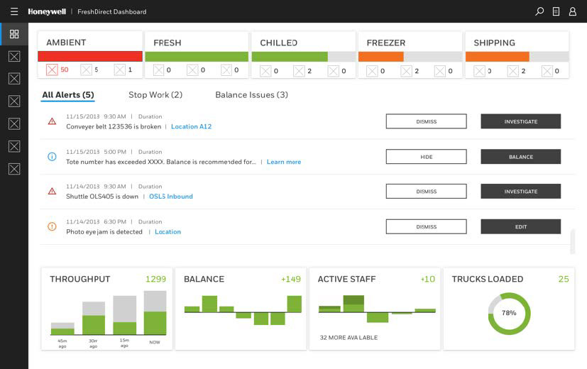
Dashboard exploration 3
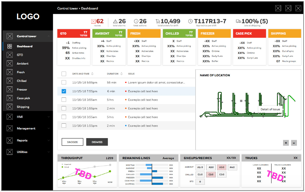
Dashboard exploration 4
Final Design
One dashboard. Many roles.
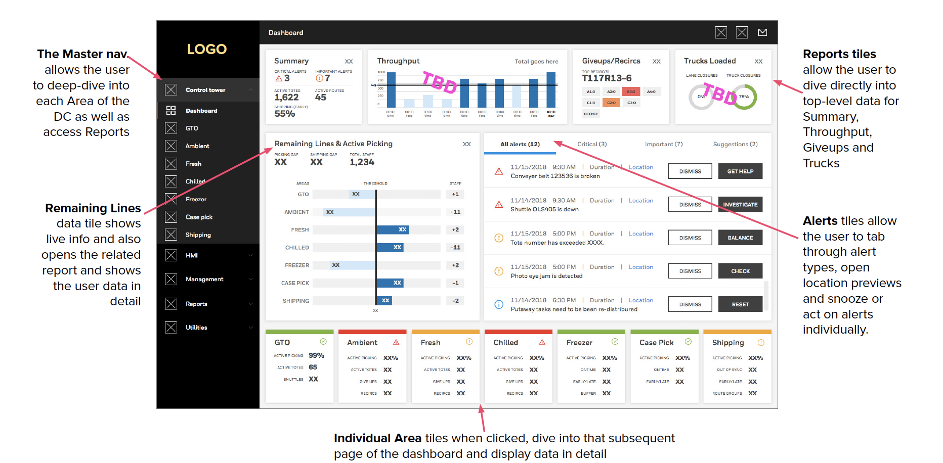
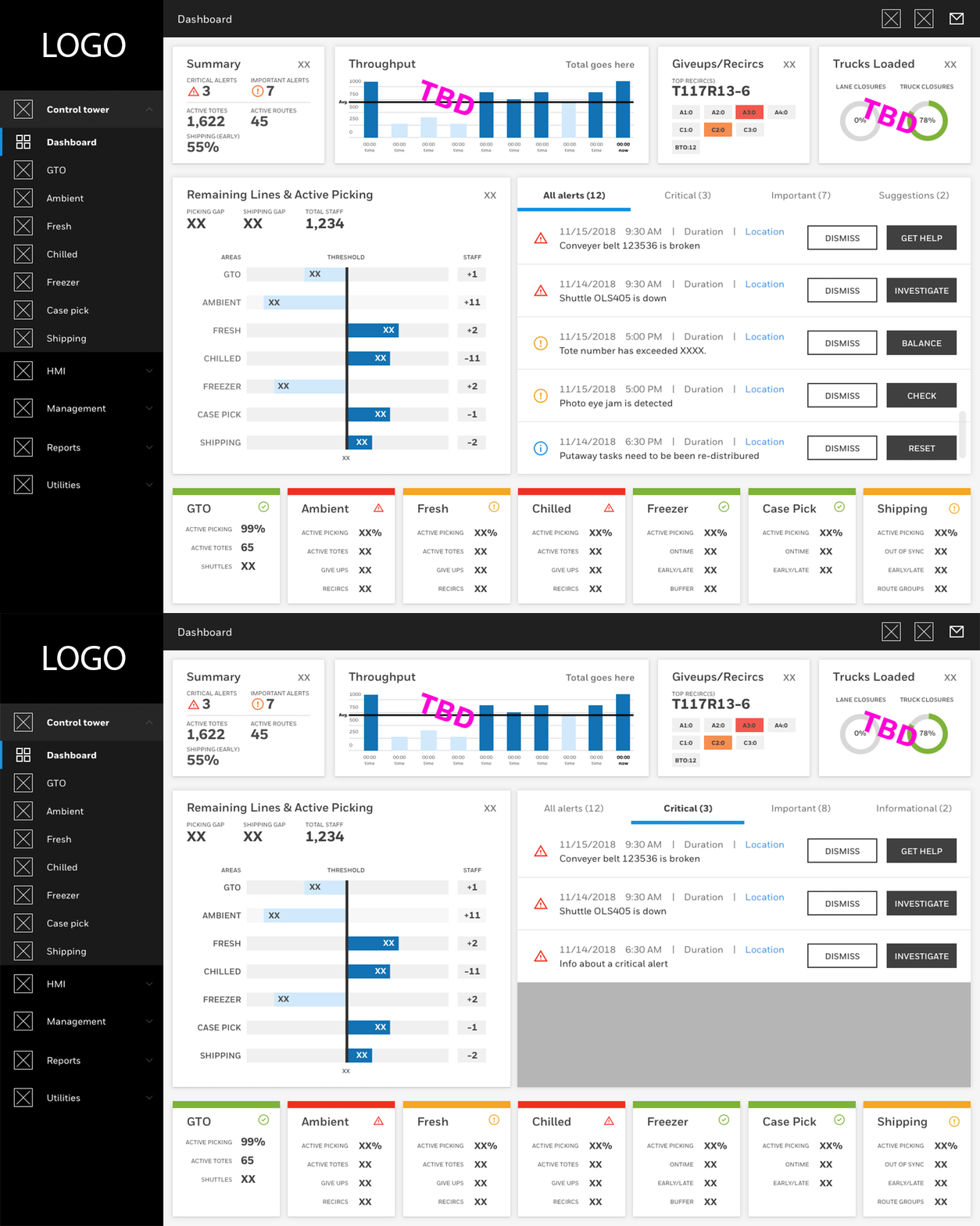
The final dashboard brought throughput, safety, and sales metrics into a unified, role-specific view — each tailored to what a Control Tower Manager vs. an Operations Supervisor actually needed to see.
Final dashboard recommendation — unified, role-specific view of DC operations
Final dashboard — animated prototype showing real-time data behavior
Presenting "Where Is My Order? Designing for Distribution Centers" at the Seattle Design Conference
Outcome
The dashboard gave operators a unified, role-specific view of operations for the first time — replacing fragmented systems with one source of truth. The project was presented at the Seattle Design Conference as a case study in enterprise UX and designing for non-traditional environments. Honeywell SPS was subsequently acquired in a $1.5B deal, with the software platform as a key part of the value proposition.