Revel / Infogain · Starbucks · 2024
Rebuilding the partner experience tool
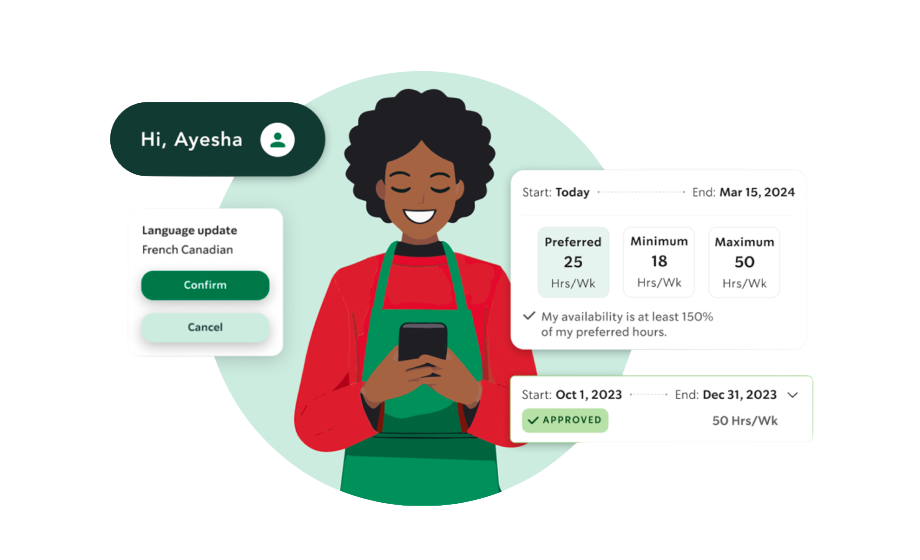
What is the Starbucks Partner Experience tool?
Starbucks Partners are the company's term for their employees — baristas, shift supervisors, store managers. The Partner experience tool is an internal platform that helps partners manage schedules, availability, preferences, and day-to-day work life. It's critical infrastructure for a company with hundreds of thousands of employees worldwide.
Overview
As UX Team Lead at Revel / Infogain, I stepped in to stabilize and lead the UX workstream on the Starbucks Partner experience tool. The engagement required building trust quickly with a new client, aligning a cross-functional team, and delivering a working MVP on a tight timeline. My work focused on the availability and preferences features — core to how partners manage their working lives.
The Problem
Partners had no reliable way to manage their own availability
Starbucks partners were managing availability and scheduling preferences through disconnected systems that didn't reflect their actual needs. The new tool needed to handle complex states — current and future availability, requests, preferences, approvals, and denials — in a way that felt simple and transparent to partners on the go.
Challenges
- Designing for a high-complexity data model with multiple availability states and request statuses
- Balancing partner needs with Starbucks' operational and legal scheduling requirements
- Establishing design standards and QA processes quickly in an existing project
- Managing client expectations while keeping the team focused on MVP delivery
- Ensuring the experience worked across both mobile and desktop contexts
Process
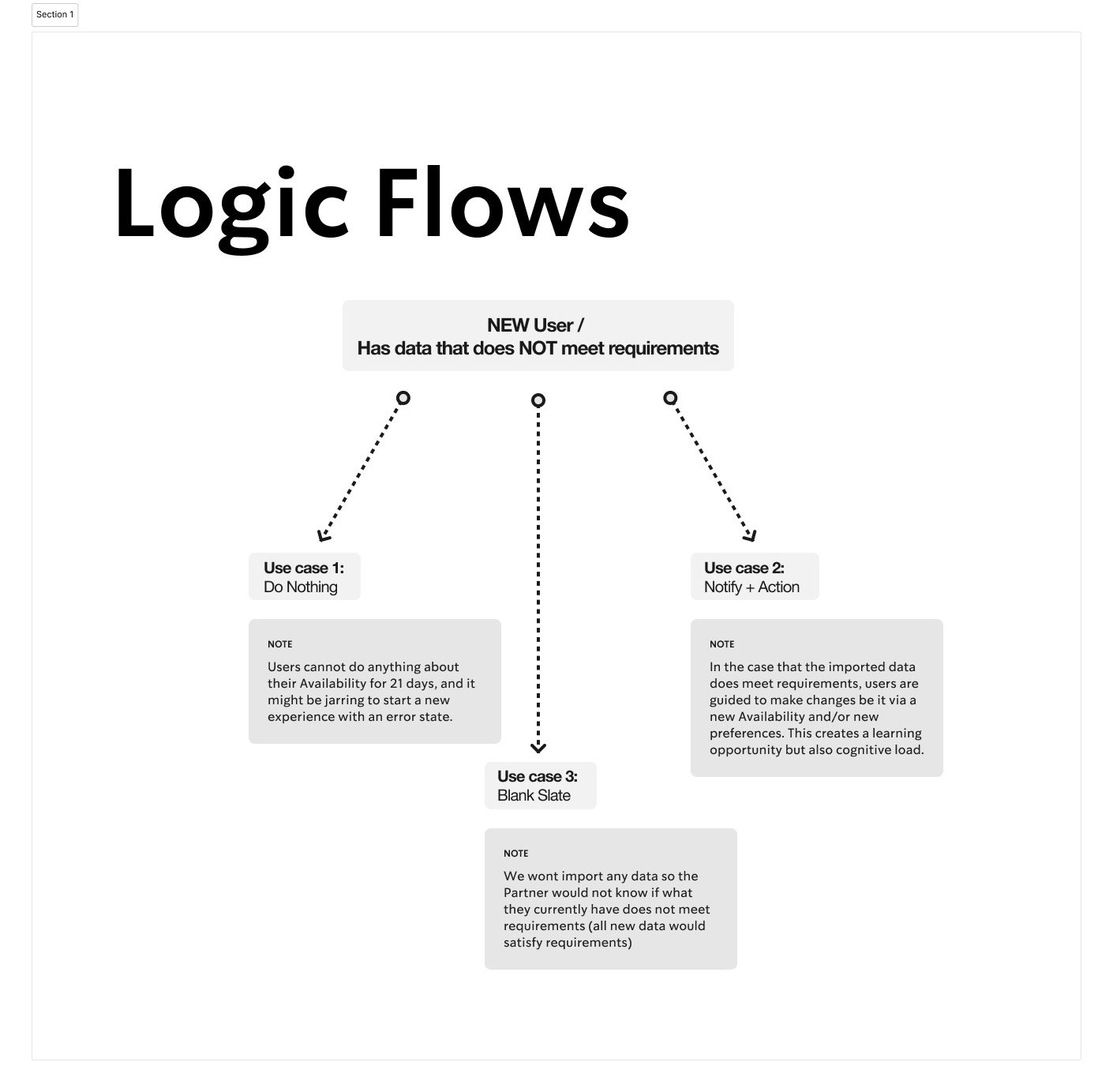
Logic flows
Mapped the decision logic for new and returning partners — three distinct use cases depending on whether the partner had existing data, needed to be notified, or was starting from a blank slate. This grounded every design decision in the right user context.
Logic flows — mapping decision paths for new user availability scenarios
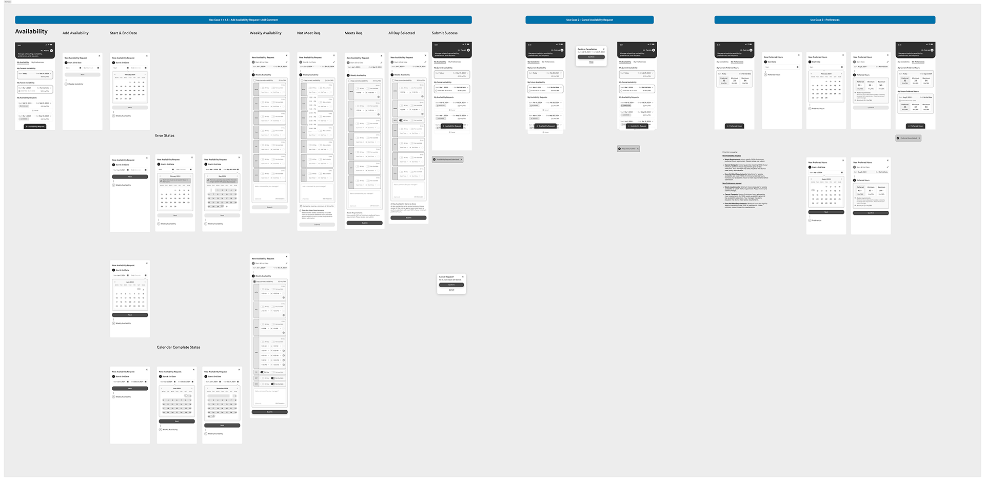
Wireframe flows
Built out detailed wireframe flows covering all use cases — adding availability, start and end dates, weekly availability, error states, calendar complete states, cancellation, and preferences. Each flow was designed to handle the complexity without surfacing it to the partner.
Wireframe flows — full use case coverage across availability and preferences
Usability Testing
Multiple rounds of moderated testing
Our path to a better Partner experience included multiple rounds of moderated usability testing. We evaluated key Partner workflows to identify experience gaps, capturing and analyzing behavioral insights to deliver intuitive, user-centric flows. A combination of data and Partner feedback fueled continuous improvements.
Our first major milestone came when we deployed an MVP solution ready for a larger-scale pilot.
Testing Result
30% increase in Partner satisfaction from the first round of usability testing — moving from 3.7 to 4.8 out of 5 on ease-of-use (1 = difficult, 5 = very easy).
Final Designs
Availability & preferences — built for the partner's reality
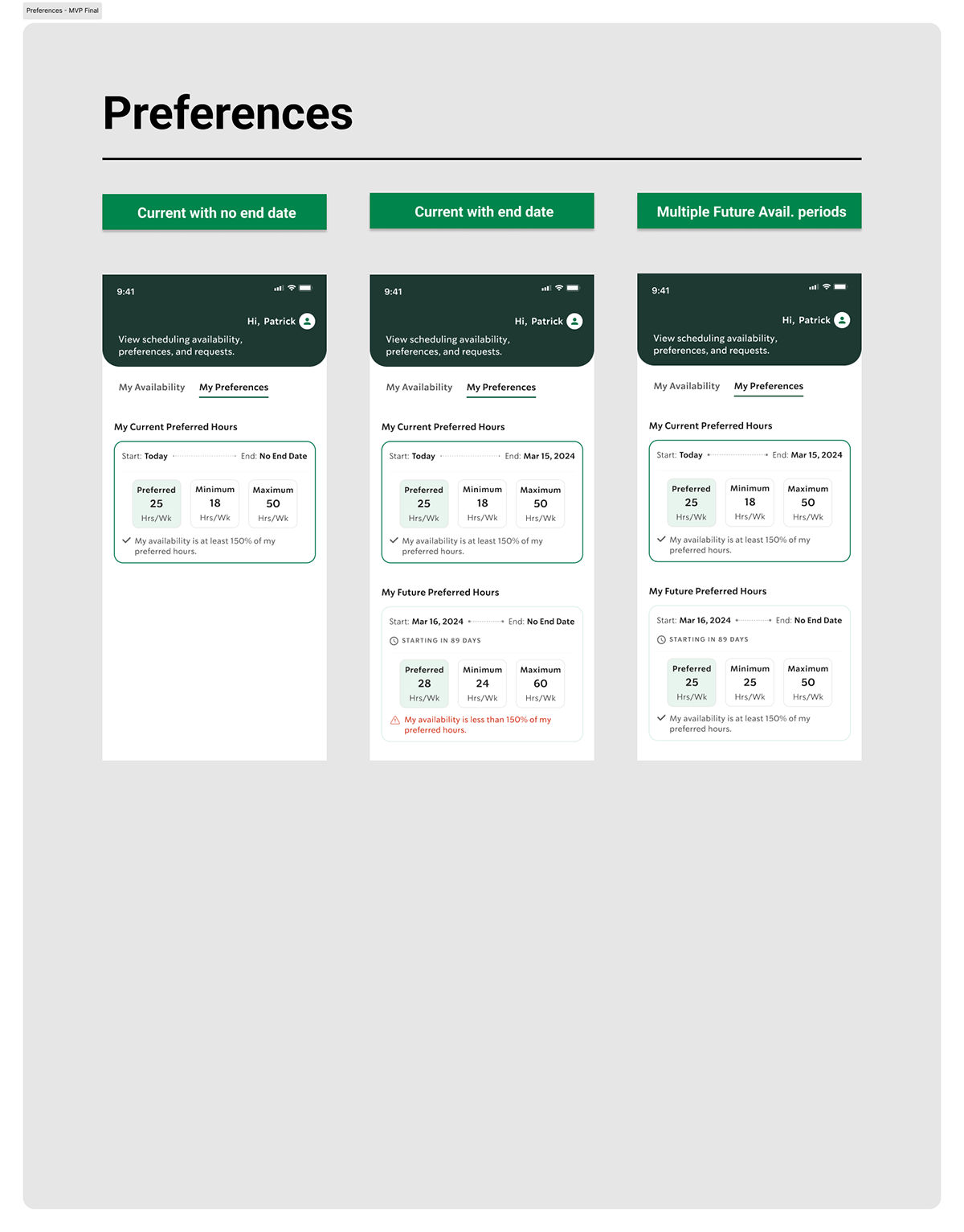
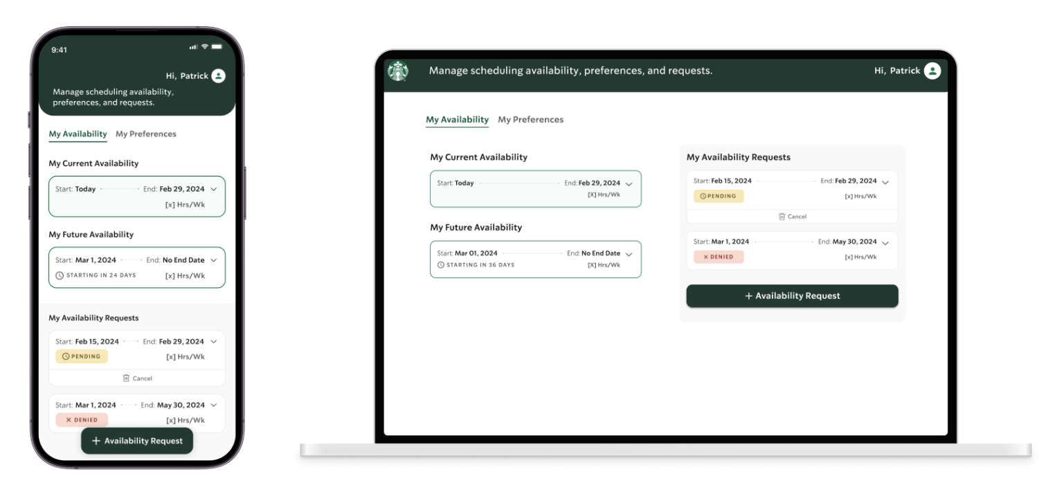
The final MVP designs covered two core surfaces: Availability (current, future, and request states) and Preferences (preferred, minimum, and maximum hours). Both needed to handle multiple simultaneous states clearly — approved, pending, denied — without overwhelming partners checking in quickly between shifts.
Availability — current, expanded, and current + future states
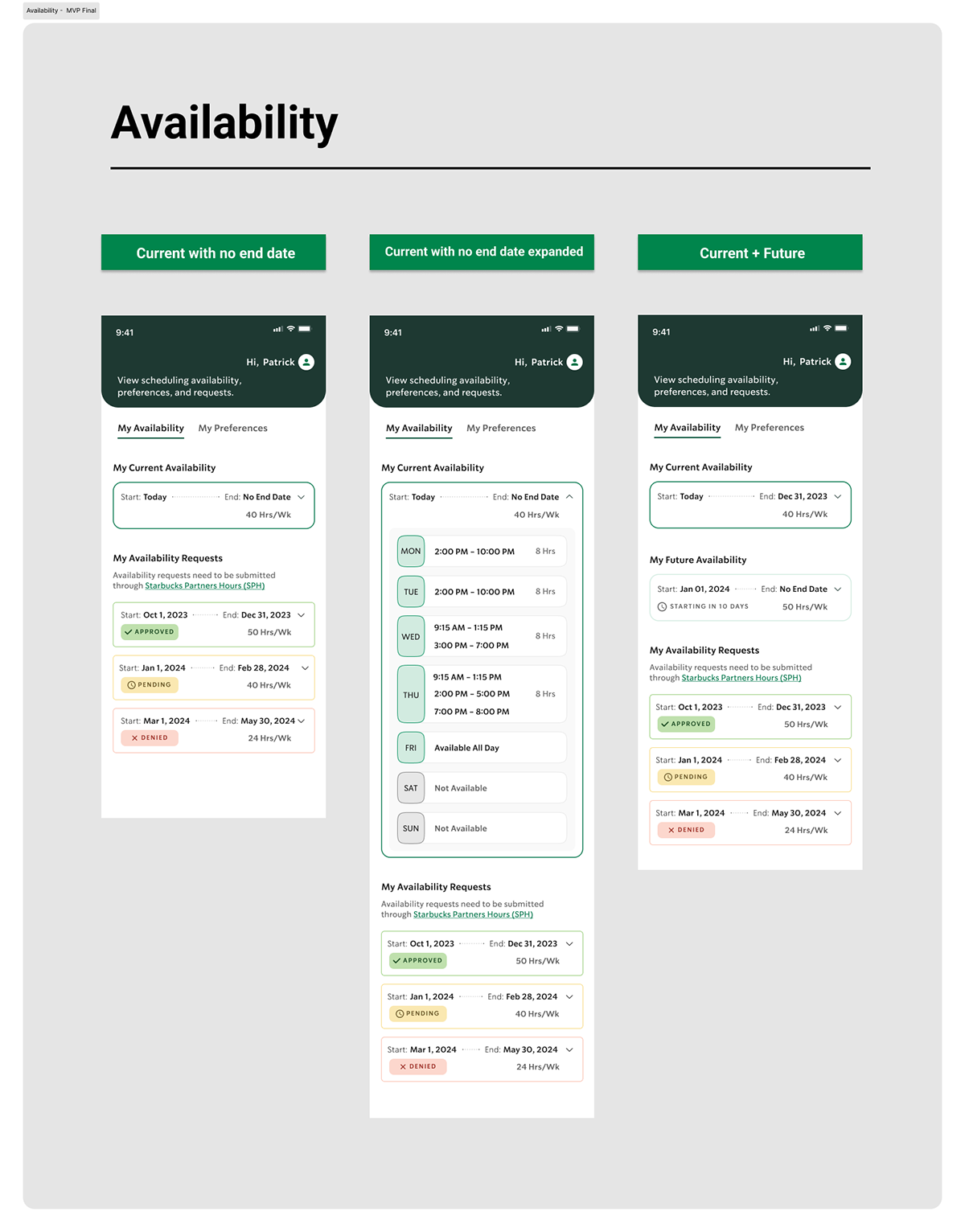
Preferences — current with no end date, current with end date, and multiple future availability periods
MVP final — availability management across mobile and desktop
Outcome
The MVP shipped on schedule and drove a 30% increase in Partner satisfaction — from 3.7 to 4.8 out of 5 on ease-of-use — in the first round of usability testing. Availability and preferences features launched with full state coverage across mobile and desktop, and the engagement set a stronger standard for design quality and delivery across the team.